Third Party Perspective: A Visual Explanation of What Makes a POD
Third Party Perspective: A Visual Explanation of What Makes A POD a POD, and why it's way better than what you think it is.
Ever since there has been artistic expression there has always been criticism. It probably wasn't very long after the first caveman posted images of himself killing mammoths and running off with cave-babes on his wall, that another caveman emerged and pissed the words "Looks Photoshopped" in the dirt below (And thus was born the comments section). Now, 20,000 or 5,000 years later depending on your literature, humanity has progressed so far as to allow us to share and piss over anything we want from cheap porcelain teacups to Iphone's. We don't even need to fear getting clubbed by the artist when we do. It's GREAT!
Unfortunately, the ease with which we are allowed to speak, and the very limited consequences that we face for our words have often led to the passing of judgment before the application of critical thought. One such example is the recent article by Matt Wragg titled "11 Steps To Getting POD". In this article Matt, or Mr. Wragg, not sure what he prefers to go by, gives a well written insight into the selection of a POD. As an amateur photographer who would love to see my photos featured someday I found this article to be a great starting point for anyone wishing to improve their photos. However, never to be deterred the comments section of this article fired up with links to photos asking "why didn't you choose me", "why did you choose this photo", "only photographers name Lorence get POD", or "You need to photograph someone with a Red Bull helmet". All of these comments makes one wonder if everyone just failed to notice Matt's opening statement that Pinkbike receives 40,000 uploads a week. That's 2,080,000 photos a year. Of those 2,080,000 photos only 365 will ever become POD. Using some basic math that results in 1.75 to the -4th of a percent. Now this number is probably inaccurate, as the majority of Pinkbike uploads are probably for the Buy/Sell site and are never intended to be a POD, however the point still stands that to in order for your photo to be POD it needs to be more than good or even great. Statistically speaking it needs to be a freaking Rockstar.
However, I don't think a lack of mathematical skills is what leads many of us in failing to realize the subtle but crucial differences between our photos and those that eventually get featured. I think what leads to this misunderstanding is a lack in the technical knowledge of composition, and a lack of visual depictions explaining these techniques in both a superb and in a subpar way. And so, since a picture is worth a 1000 words, I am going to try and show you basic composition techniques such as the Golden Ratio, the Rule of Thirds, Leading Lines, and Fore-middle-and background placement by showing how a POD employs these rules, and how an amateur (aka me) employs those same techniques in comparison with the pros.
Disclaimer 1: I am not an expert in international photography etiquette, and so if any of the artists, whose work is used here feel that I am violating or misusing their photos I apologize. Let me know and I will remove them. To be clear, I am only using photos that have already been shared in Pinkbike related articles, and I am operating under the assumption that they are okay with this kind of use.
Disclaimer 2: This article is not going to try and defend every POD choice ever made. Yes I have seen the High Roller photo. No, I don't necessarily agree that it is POD worthy. However, as Mr. Wragg so eloquently put it "That [photo] was chosen by Colin Meagher, [...] Simple fact is that the photo did the most important thing a photo can do - it stirred emotion in him. And Colin has been shooting since you were an itch in your father's crotch, so he's earned the right to choose whatever turns him on."(Comments Section of Article "11 Steps To Getting POD" ), and that is something I do agree with. If you can't handle that, then please, go start your own internationally acclaimed mountain bike website, spend over a decade building a network of photographers, and then choose your own damn PODs. No one is stopping you.
Now that that's out of the way, let's get down to the stuff we all came here to see: the photos.
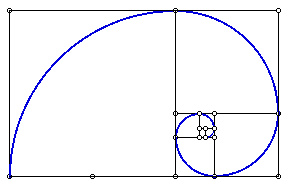
The Golden Ration or The Rule of Thirds:
![Third Party Perspective A Visual Explanation of What Makes a POD a POD]()
Technical Definition: The Golden Mean, a.k.a. the Rule of Thirds, is the proportion arising from the division of a straight line into two parts, so that the ratio of the whole line to the larger part is exactly the same as the ratio of the larger part to the smaller part.
Simple Definition: By placing the most important element of your photo on one of the four cross-hairs you will most likely achieve this ratio.
![Third Party Perspective A Visual Explanation of What Makes a POD a POD]()
Advanced Definition: Once you get the hang of this the Rule of Thirds, try making taking things a step further by using the Golden Ratio instead.
Great POD Examples:
![Finals Photo Epic - Mont St Anne DH World Cup 5]()
Notice how the lip of the jump and the position of the rider effectively fill in the bottom third of the shot and the far left. This kind of composition effectively guides the eye so that the primary elements that stand out are the rider and the jump. This enhances the impact that you as a reader will feel because you are less likely to be distracted by other elements like the background. Also, if you were to put the golden ratio over this image you would see that the key focal point is the rider's face, and then the eye will circle counter-clockwise along the edge of the frame and right over the lip of the jump. Think of this as instantaneous story telling. In the fraction of a second that it took for your eye to take in this photo the subtle placement of rider and jump told you an entire story.
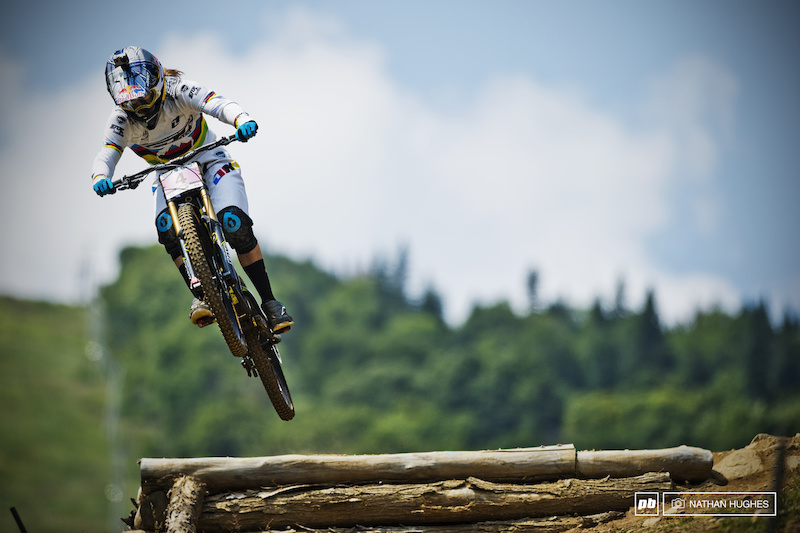
![Deep down in the misty woods Chris Akrigg came out to play.]()
When I first saw this photo I immediately thought GOLDEN RATIO. While the technical skill of the rider is always something to behold, this photographer made the most of his rider's skill by positioning himself so that the fallen tree would serve to enhance the golden ratio. This time we begin with the rider, and we end at the sun. Which is currently shooting a ray of light directly back at the rider. This type of composition brings the viewer full circle, and not only makes sure that the viewer takes in the beautiful scenery and the amazing rider, but it links the two together. Once again telling a story, that (for me at least) shows a unity between rider and landscape that very few riders ever achieve.
Not So Great Examples:
Now when the photo is as great as the ones featured above it's easy to see what was done right, but very hard to see what was done poorly. So here are a few examples of my attempts to implement the rule of thirds into my mountain bike photography. (Note: Most of these shots are of Professional EWS Racers, so image quality is totally dependent upon the photographer).
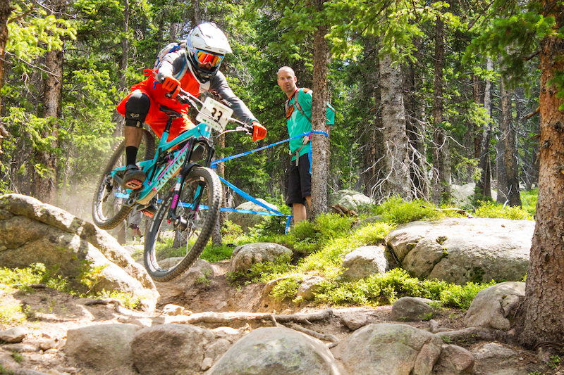
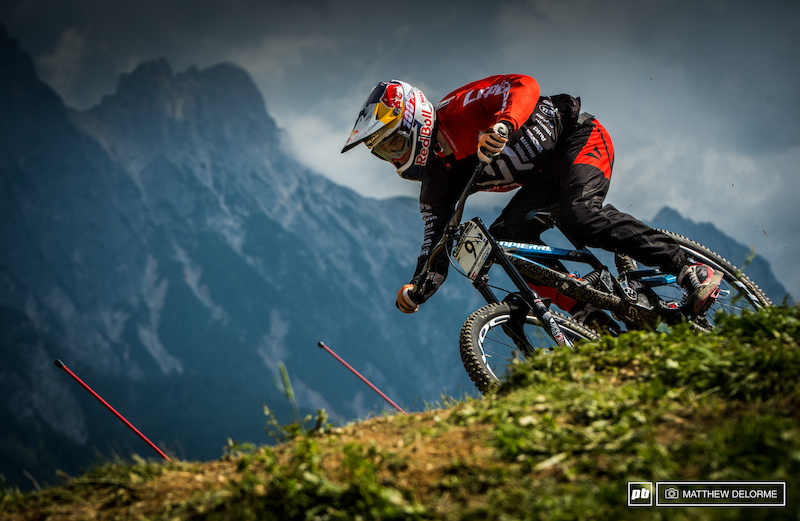
![Third Party Perspective A Visual Explanation of What Makes a POD a POD]()
While, I am sure that there is much more wrong with this photo that admitted to here (weak focus and heavy handed saturation.. *cough, cough.*(Give me a break though. You try photographing WC riders with a camera that takes .5 frames per second and freezes after 3 consecutive shots), the key element that I want to point out, is that while I do follow the rule of thirds for both the rider and the rocky terrain, the balance of this image gets thrown off by the trees on the far side of the frame. The rider has to compete with the trees for the eye's attention. In short, there's too much going on for the viewer to fully appreciate the rider, and thus the shot becomes weaker.
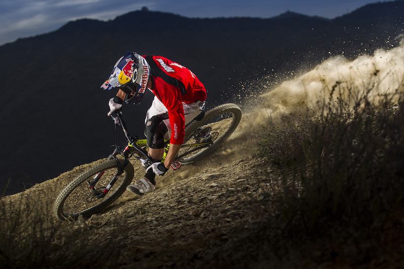
![Third Party Perspective A Visual Explanation of What Makes a POD a POD]()
Likewise, this image could be an example of the Golden ratio, beginning with the head and working around to the larger rocks below, however that pesky racer standing dead center to the background distracts from the focal point of the image. That combined with the multiple lines of tape running from the rider to the photo-bomber make it all but impossible to ignore him, and throw off the balance of the shot.
Lesson Learned: When applying the Rule of Thirds, look for anything that could distract away from the subject. Even better, position potential distractions so that they enhance the image.
Leading Lines or Vanishing Point
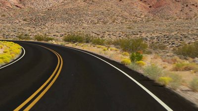
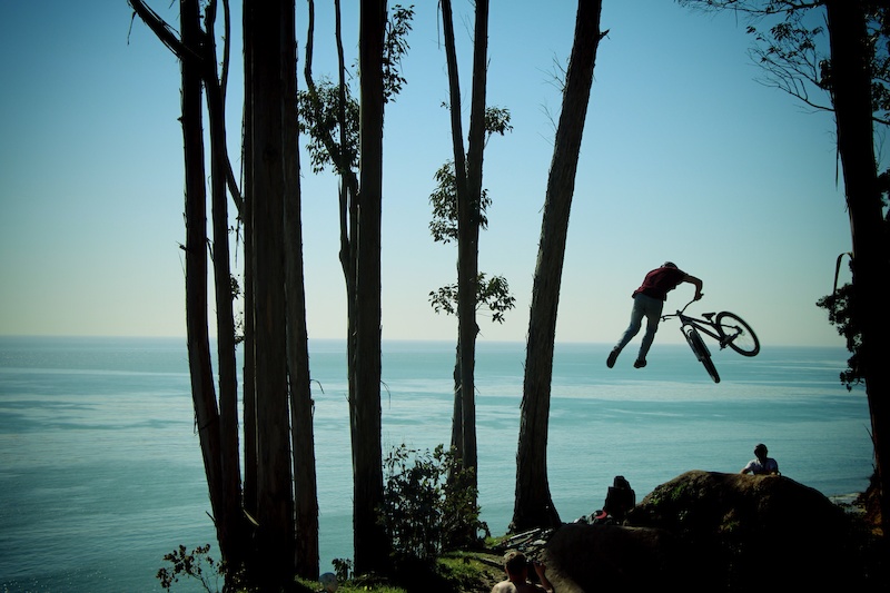
![Third Party Perspective A Visual Explanation of What Makes a POD a POD]()
We've all seen this image. We all probably have more types of this shot on our Smart Phones that we'd like to admit. In the photography world it's pretty cliche, but it demonstrates so very well the power that a line placement can have on a photo. The yellow and white lines on the road are designed to direct your attention from the foreground all the way into the background without having to provide excessive amounts of detail. It's a simple trick that if we think back to our 5th grade art class we'll remember.
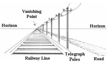
![Third Party Perspective A Visual Explanation of What Makes a POD a POD]()
Does this look familiar? One of the key elements of good composition is the alignment of both the horizon line in the background with the leading lines of the foreground. Place your subject along one of those lines and BOOM, instant image story telling.
Great POD Examples:
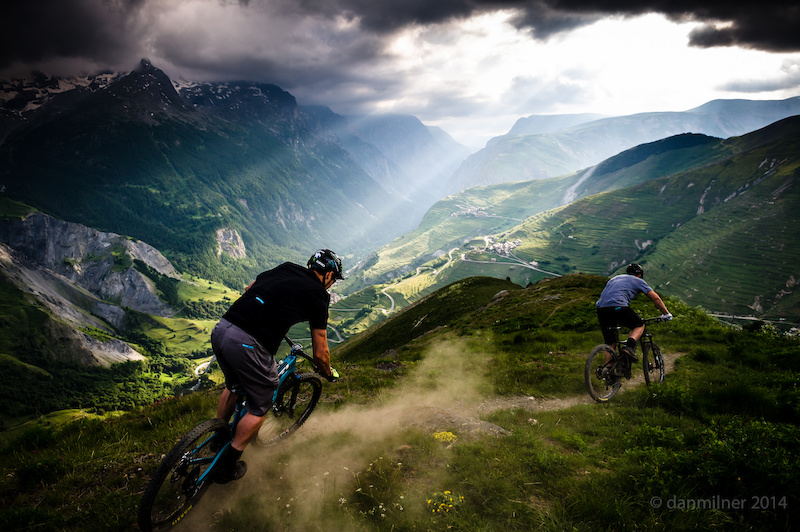
![A late ride session above La Grave in between stormy interludes in June 2014. The guys on the new SB5 getting them dialed 2 weeks before the bike was officially launched and a month before Richie won EWS stages in Colorado on the same bike.]()
Great shooting location and light aside one of the strongest elements of this photo is the use of the trail, ridges, and roads as leading lines. Notice how the trail in the foreground ends near the ridgeline, which then almost seamlessly connects with the road miles away in the background. It doesn't matter if the road or trail actually connect, what matters is that the placement of those lines gently guides the viewer from the foreground for miles all the way into the background. The placement of the rider at the beginning of this line instantly tells the viewer the path that these riders are going to follow for the rest of their ride. It gives location and destination in one fell swoop, and by connecting a line between foreground, middle ground, and background, the image gains an amazing amount of depth. Those mountains on the other side of the valley feel that much closer.
![Early morning ride down from Gornergrat. Great trails and great light. Shot with Mamiya 7ii on Kodak Portra 400]()
The leading lines in this shot are harder to notice, but they are there and they make all the difference. Notice how this image seems to completely ignore the rule of thirds and places the rider fairly close to the center of the shot. Technically this is a no-no, however if you were to draw a horizontal line dividing the reflection from the background, and then another line from the tip of the Matterhorn to its reflection you will notice something pretty cool. Right at the crossing of those two lines you have the rider. What this shot does, is it takes symmetry and uses it to take a background that would very easily dominate the rider and uses that very same background to make sure that you see the rider. This is a prime example of knowing when to break a rule, and it paid off because the photographer knew that another rule was being used.
Not So Great Examples:
![Third Party Perspective A Visual Explanation of What Makes a POD a POD]()
This image has leading lines , but unfortunately they don't do anything to enhance the motion or direction of the rider. Instead of connecting the foreground to the back ground they cut across the frame and rob the shot of depth. Normally you want to use leading lines to connect one element of an image to another, but since these lines do not lead anywhere in the end they just distract from the speed and skill of that the rider is demonstrating here.
![Third Party Perspective A Visual Explanation of What Makes a POD a POD]()
While not a cycling photo, this image serves to demonstrate what can happen when no leading lines are present. This very beautiful sunrise of Horseshoe Bay, just south of Whistler was robbed of any true depth because both the fore and background are flat, and there is nothing really connecting the islands in the middle ground to anything else. The result, a flat image that doesn't jump off the screen. Even the placement of a rider or a boat in this image would still be weak because there is nothing connecting the scenery to the object.
![Third Party Perspective A Visual Explanation of What Makes a POD a POD]()
In this image I think I finally figured out how to use my leading lines, however, by placing myself above the rider I made the terrain look flatter than it actually was. What was supposed to be a leading line of a wickedly steep and rocky trail now becomes something that looks fairly tame.
Lesson learned: When shooting a single subject(a close up of a rider) make sure that nothing is distracting from the subject. When shooting multiple subjects(scenery and rider) use leading lines to connect the two. If you don't, the shot will lose depth and feel flat. Also be aware of your position as a photographer and how that can weaken even the best leading lines.
Foreground, Middleground, and Background
I've already touched on this a little bit, but even when you're not shooting large landscapes this is a crucial thing to keep in mind when shooting. As you will see in the examples, it's an amazing means of taking a simple shot and making it incredibly strong. No need for diagrams here, so lets just jump right into things.
Great POD Examples:
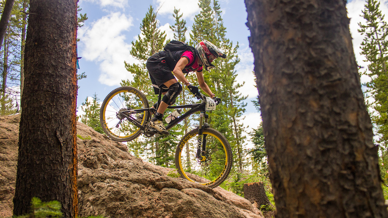
![Loic Bruni took his first podium here last year. He qualified first today. Can Loic take his first World Cup win here tomorrow He was .415 seconds up on Aaron Gwin. If he does it could be a real close one.]()
![Curtis Keene in Los Angeles California February 2014.]()
In both of these photos these two riders are both performing fairly simple maneuvers. However, their solid placement in the middleground gives them a compositional edge. Both photos place the foreground in the bottom right of the frame, then place the rider/trail at a similar angle in the middleground, and then the background behind the rider in the upper left of the frame. In both of these shots think the rule of thirds, but instead of vertical and horizontal lines, the photographer is dividing the frame at an angle. The use of these angles makes the trail seem steeper and more technical that it probably is, and the lines dividing the fore, middle, and background serve as leading lines to give the sensation of speed and direction. It's so simple, but it does so much in giving the shot that amazing feeling.
Not So Great Examples:
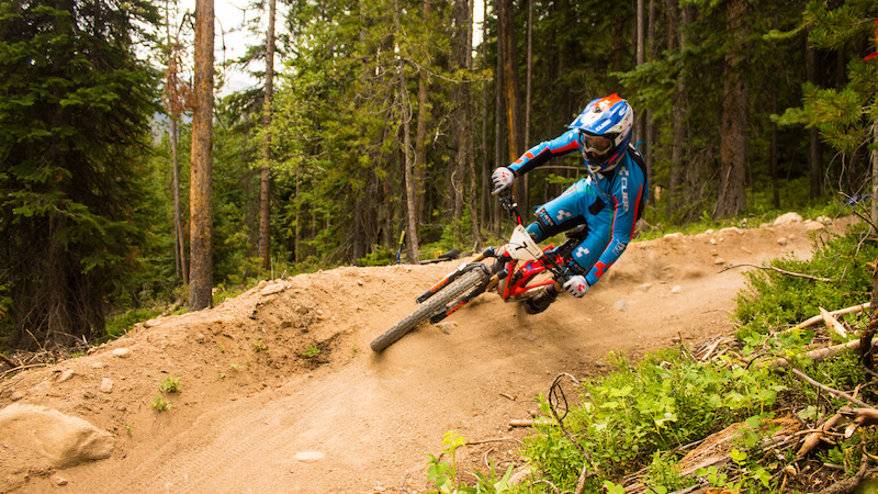
![Third Party Perspective A Visual Explanation of What Makes a POD a POD]()
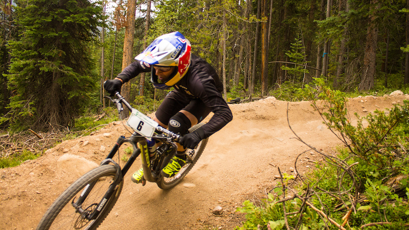
![Third Party Perspective A Visual Explanation of What Makes a POD a POD]()
Once again, my poor post-processing skills and focus problems aside, these shots are weaker than the previous two, simply because I don't implement the use of fore, middle, and background in a way that enhances the skill of the rider. Despite the fact that I have nearly the exact same composition of foreground in the bottom right, and background in the upper left the dividing lines between each of these areas is more or less horizontal, which once again: makes the trail look flat and boring. Also, in the lower shot the branch that crosses the trail weakens the composition considerably. Please note: That the use of a Red Bull Helmet did not make this a POD worthy shot.
Lesson Learned: When positioning fore, middle, and background make sure that they are used to enhance the motion of the rider.
Framing
Another photography trick is to use very dominant lines to create a frame within a frame.
Great POD Example:
![Tailwhip. PHOTO CREDIT --- THE Ray George]()
Take this shot for example. By placing the rider between those two trees the subject becomes effectively framed. This in turn enhances the rule of thirds already put into place, while at the same time taking what could be distracting trees and using them to instead enhance the shot. The strength of this framing is what keeps other distracting elements such as the guy in the foreground, the bikes lying around, and the spectators by the landing, from becoming too dominant in the picture.
Not So Great Example:
![Third Party Perspective A Visual Explanation of What Makes a POD a POD]()
While this shot does effectively frame the rider, and enhances the steepness of this terrain it is still weak for a couple of reasons. The first is that the trees used to create the frame are too large and dominant, and the second is that in order to create the frame I had to ignore the rule of thirds. By making that decision I weakened the shot by making it obvious that I was ignoring one rule and not making up for it with another.
Lesson Learned: All photographic choices come at a cost. Make sure that when you're trying to do one thing that you're not ignoring another.
As I am sure the comments section will indicate, there are many more elements of mountain biking photography that make my photos weaker than those chosen for POD. However, I hope that by putting my photography onto the chopping block you all had a chance to see how you could improve your own photography. Keep riding, and keep shooting.
Ever since there has been artistic expression there has always been criticism. It probably wasn't very long after the first caveman posted images of himself killing mammoths and running off with cave-babes on his wall, that another caveman emerged and pissed the words "Looks Photoshopped" in the dirt below (And thus was born the comments section). Now, 20,000 or 5,000 years later depending on your literature, humanity has progressed so far as to allow us to share and piss over anything we want from cheap porcelain teacups to Iphone's. We don't even need to fear getting clubbed by the artist when we do. It's GREAT!
Unfortunately, the ease with which we are allowed to speak, and the very limited consequences that we face for our words have often led to the passing of judgment before the application of critical thought. One such example is the recent article by Matt Wragg titled "11 Steps To Getting POD". In this article Matt, or Mr. Wragg, not sure what he prefers to go by, gives a well written insight into the selection of a POD. As an amateur photographer who would love to see my photos featured someday I found this article to be a great starting point for anyone wishing to improve their photos. However, never to be deterred the comments section of this article fired up with links to photos asking "why didn't you choose me", "why did you choose this photo", "only photographers name Lorence get POD", or "You need to photograph someone with a Red Bull helmet". All of these comments makes one wonder if everyone just failed to notice Matt's opening statement that Pinkbike receives 40,000 uploads a week. That's 2,080,000 photos a year. Of those 2,080,000 photos only 365 will ever become POD. Using some basic math that results in 1.75 to the -4th of a percent. Now this number is probably inaccurate, as the majority of Pinkbike uploads are probably for the Buy/Sell site and are never intended to be a POD, however the point still stands that to in order for your photo to be POD it needs to be more than good or even great. Statistically speaking it needs to be a freaking Rockstar.
However, I don't think a lack of mathematical skills is what leads many of us in failing to realize the subtle but crucial differences between our photos and those that eventually get featured. I think what leads to this misunderstanding is a lack in the technical knowledge of composition, and a lack of visual depictions explaining these techniques in both a superb and in a subpar way. And so, since a picture is worth a 1000 words, I am going to try and show you basic composition techniques such as the Golden Ratio, the Rule of Thirds, Leading Lines, and Fore-middle-and background placement by showing how a POD employs these rules, and how an amateur (aka me) employs those same techniques in comparison with the pros.
Disclaimer 1: I am not an expert in international photography etiquette, and so if any of the artists, whose work is used here feel that I am violating or misusing their photos I apologize. Let me know and I will remove them. To be clear, I am only using photos that have already been shared in Pinkbike related articles, and I am operating under the assumption that they are okay with this kind of use.
Disclaimer 2: This article is not going to try and defend every POD choice ever made. Yes I have seen the High Roller photo. No, I don't necessarily agree that it is POD worthy. However, as Mr. Wragg so eloquently put it "That [photo] was chosen by Colin Meagher, [...] Simple fact is that the photo did the most important thing a photo can do - it stirred emotion in him. And Colin has been shooting since you were an itch in your father's crotch, so he's earned the right to choose whatever turns him on."(Comments Section of Article "11 Steps To Getting POD" ), and that is something I do agree with. If you can't handle that, then please, go start your own internationally acclaimed mountain bike website, spend over a decade building a network of photographers, and then choose your own damn PODs. No one is stopping you.
Now that that's out of the way, let's get down to the stuff we all came here to see: the photos.
The Golden Ration or The Rule of Thirds:

Technical Definition: The Golden Mean, a.k.a. the Rule of Thirds, is the proportion arising from the division of a straight line into two parts, so that the ratio of the whole line to the larger part is exactly the same as the ratio of the larger part to the smaller part.
Simple Definition: By placing the most important element of your photo on one of the four cross-hairs you will most likely achieve this ratio.
Advanced Definition: Once you get the hang of this the Rule of Thirds, try making taking things a step further by using the Golden Ratio instead.
Great POD Examples:
Notice how the lip of the jump and the position of the rider effectively fill in the bottom third of the shot and the far left. This kind of composition effectively guides the eye so that the primary elements that stand out are the rider and the jump. This enhances the impact that you as a reader will feel because you are less likely to be distracted by other elements like the background. Also, if you were to put the golden ratio over this image you would see that the key focal point is the rider's face, and then the eye will circle counter-clockwise along the edge of the frame and right over the lip of the jump. Think of this as instantaneous story telling. In the fraction of a second that it took for your eye to take in this photo the subtle placement of rider and jump told you an entire story.
When I first saw this photo I immediately thought GOLDEN RATIO. While the technical skill of the rider is always something to behold, this photographer made the most of his rider's skill by positioning himself so that the fallen tree would serve to enhance the golden ratio. This time we begin with the rider, and we end at the sun. Which is currently shooting a ray of light directly back at the rider. This type of composition brings the viewer full circle, and not only makes sure that the viewer takes in the beautiful scenery and the amazing rider, but it links the two together. Once again telling a story, that (for me at least) shows a unity between rider and landscape that very few riders ever achieve.
Not So Great Examples:
Now when the photo is as great as the ones featured above it's easy to see what was done right, but very hard to see what was done poorly. So here are a few examples of my attempts to implement the rule of thirds into my mountain bike photography. (Note: Most of these shots are of Professional EWS Racers, so image quality is totally dependent upon the photographer).
While, I am sure that there is much more wrong with this photo that admitted to here (weak focus and heavy handed saturation.. *cough, cough.*(Give me a break though. You try photographing WC riders with a camera that takes .5 frames per second and freezes after 3 consecutive shots), the key element that I want to point out, is that while I do follow the rule of thirds for both the rider and the rocky terrain, the balance of this image gets thrown off by the trees on the far side of the frame. The rider has to compete with the trees for the eye's attention. In short, there's too much going on for the viewer to fully appreciate the rider, and thus the shot becomes weaker.
Likewise, this image could be an example of the Golden ratio, beginning with the head and working around to the larger rocks below, however that pesky racer standing dead center to the background distracts from the focal point of the image. That combined with the multiple lines of tape running from the rider to the photo-bomber make it all but impossible to ignore him, and throw off the balance of the shot.
Lesson Learned: When applying the Rule of Thirds, look for anything that could distract away from the subject. Even better, position potential distractions so that they enhance the image.
Leading Lines or Vanishing Point
We've all seen this image. We all probably have more types of this shot on our Smart Phones that we'd like to admit. In the photography world it's pretty cliche, but it demonstrates so very well the power that a line placement can have on a photo. The yellow and white lines on the road are designed to direct your attention from the foreground all the way into the background without having to provide excessive amounts of detail. It's a simple trick that if we think back to our 5th grade art class we'll remember.
Does this look familiar? One of the key elements of good composition is the alignment of both the horizon line in the background with the leading lines of the foreground. Place your subject along one of those lines and BOOM, instant image story telling.
Great POD Examples:
Great shooting location and light aside one of the strongest elements of this photo is the use of the trail, ridges, and roads as leading lines. Notice how the trail in the foreground ends near the ridgeline, which then almost seamlessly connects with the road miles away in the background. It doesn't matter if the road or trail actually connect, what matters is that the placement of those lines gently guides the viewer from the foreground for miles all the way into the background. The placement of the rider at the beginning of this line instantly tells the viewer the path that these riders are going to follow for the rest of their ride. It gives location and destination in one fell swoop, and by connecting a line between foreground, middle ground, and background, the image gains an amazing amount of depth. Those mountains on the other side of the valley feel that much closer.
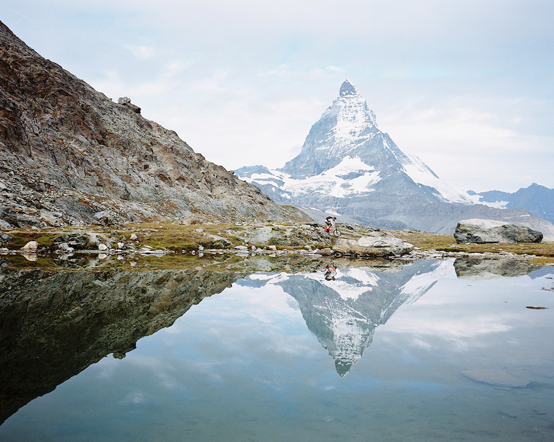
The leading lines in this shot are harder to notice, but they are there and they make all the difference. Notice how this image seems to completely ignore the rule of thirds and places the rider fairly close to the center of the shot. Technically this is a no-no, however if you were to draw a horizontal line dividing the reflection from the background, and then another line from the tip of the Matterhorn to its reflection you will notice something pretty cool. Right at the crossing of those two lines you have the rider. What this shot does, is it takes symmetry and uses it to take a background that would very easily dominate the rider and uses that very same background to make sure that you see the rider. This is a prime example of knowing when to break a rule, and it paid off because the photographer knew that another rule was being used.
Not So Great Examples:
This image has leading lines , but unfortunately they don't do anything to enhance the motion or direction of the rider. Instead of connecting the foreground to the back ground they cut across the frame and rob the shot of depth. Normally you want to use leading lines to connect one element of an image to another, but since these lines do not lead anywhere in the end they just distract from the speed and skill of that the rider is demonstrating here.
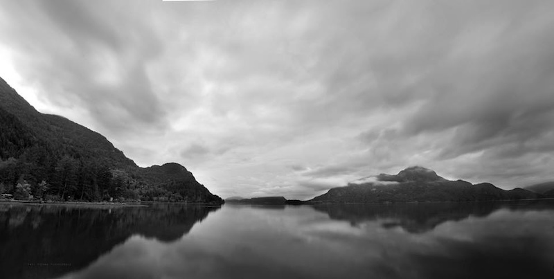
While not a cycling photo, this image serves to demonstrate what can happen when no leading lines are present. This very beautiful sunrise of Horseshoe Bay, just south of Whistler was robbed of any true depth because both the fore and background are flat, and there is nothing really connecting the islands in the middle ground to anything else. The result, a flat image that doesn't jump off the screen. Even the placement of a rider or a boat in this image would still be weak because there is nothing connecting the scenery to the object.
In this image I think I finally figured out how to use my leading lines, however, by placing myself above the rider I made the terrain look flatter than it actually was. What was supposed to be a leading line of a wickedly steep and rocky trail now becomes something that looks fairly tame.
Lesson learned: When shooting a single subject(a close up of a rider) make sure that nothing is distracting from the subject. When shooting multiple subjects(scenery and rider) use leading lines to connect the two. If you don't, the shot will lose depth and feel flat. Also be aware of your position as a photographer and how that can weaken even the best leading lines.
Foreground, Middleground, and Background
I've already touched on this a little bit, but even when you're not shooting large landscapes this is a crucial thing to keep in mind when shooting. As you will see in the examples, it's an amazing means of taking a simple shot and making it incredibly strong. No need for diagrams here, so lets just jump right into things.
Great POD Examples:
In both of these photos these two riders are both performing fairly simple maneuvers. However, their solid placement in the middleground gives them a compositional edge. Both photos place the foreground in the bottom right of the frame, then place the rider/trail at a similar angle in the middleground, and then the background behind the rider in the upper left of the frame. In both of these shots think the rule of thirds, but instead of vertical and horizontal lines, the photographer is dividing the frame at an angle. The use of these angles makes the trail seem steeper and more technical that it probably is, and the lines dividing the fore, middle, and background serve as leading lines to give the sensation of speed and direction. It's so simple, but it does so much in giving the shot that amazing feeling.
Not So Great Examples:
Once again, my poor post-processing skills and focus problems aside, these shots are weaker than the previous two, simply because I don't implement the use of fore, middle, and background in a way that enhances the skill of the rider. Despite the fact that I have nearly the exact same composition of foreground in the bottom right, and background in the upper left the dividing lines between each of these areas is more or less horizontal, which once again: makes the trail look flat and boring. Also, in the lower shot the branch that crosses the trail weakens the composition considerably. Please note: That the use of a Red Bull Helmet did not make this a POD worthy shot.
Lesson Learned: When positioning fore, middle, and background make sure that they are used to enhance the motion of the rider.
Framing
Another photography trick is to use very dominant lines to create a frame within a frame.
Great POD Example:
Take this shot for example. By placing the rider between those two trees the subject becomes effectively framed. This in turn enhances the rule of thirds already put into place, while at the same time taking what could be distracting trees and using them to instead enhance the shot. The strength of this framing is what keeps other distracting elements such as the guy in the foreground, the bikes lying around, and the spectators by the landing, from becoming too dominant in the picture.
Not So Great Example:
While this shot does effectively frame the rider, and enhances the steepness of this terrain it is still weak for a couple of reasons. The first is that the trees used to create the frame are too large and dominant, and the second is that in order to create the frame I had to ignore the rule of thirds. By making that decision I weakened the shot by making it obvious that I was ignoring one rule and not making up for it with another.
Lesson Learned: All photographic choices come at a cost. Make sure that when you're trying to do one thing that you're not ignoring another.
As I am sure the comments section will indicate, there are many more elements of mountain biking photography that make my photos weaker than those chosen for POD. However, I hope that by putting my photography onto the chopping block you all had a chance to see how you could improve your own photography. Keep riding, and keep shooting.
Author Info:
Must Read This Week
[UPDATED] Final Elite XC Results & Overall Standings from the Mairiporã XC World Cup 2024
41933 views
41933 views
Sign Up for the Pinkbike Newsletter - All the Biggest, Most Interesting Stories in your Inbox
PB Newsletter Signup
1 Comment
- 1 0
Great article!
Login or Sign Up