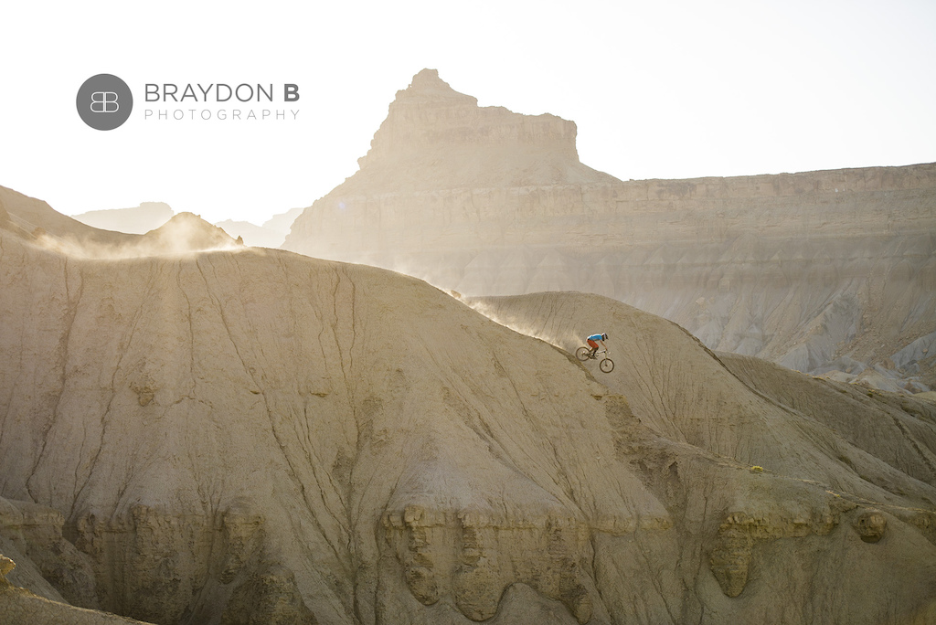
There has been a bombing in the desert

950
Views
7
Comments
11
Favs
Photo info
- Album
- Category
- All Mountain/Enduro
- Date Posted
- May 12, 2014 at 0:55May 12, 2014
- Location
-
Green River, Utah, United States

- Trail
- Green River
- Riders
- Jared Smith
Photo details
- Photo Size:
- Camera
- Nikon D600
- Lens
- 70.0-200.0 mm f/2.8
- Shutter Speed
- 1/1600
- Aperture
- 2.8
- Focal Length
- 86.0 mm
- ISO Speed
- 160
- Date
- 2014:05:09
- Time
- 18:57:12
- Copyright ©
- Braydon Ball