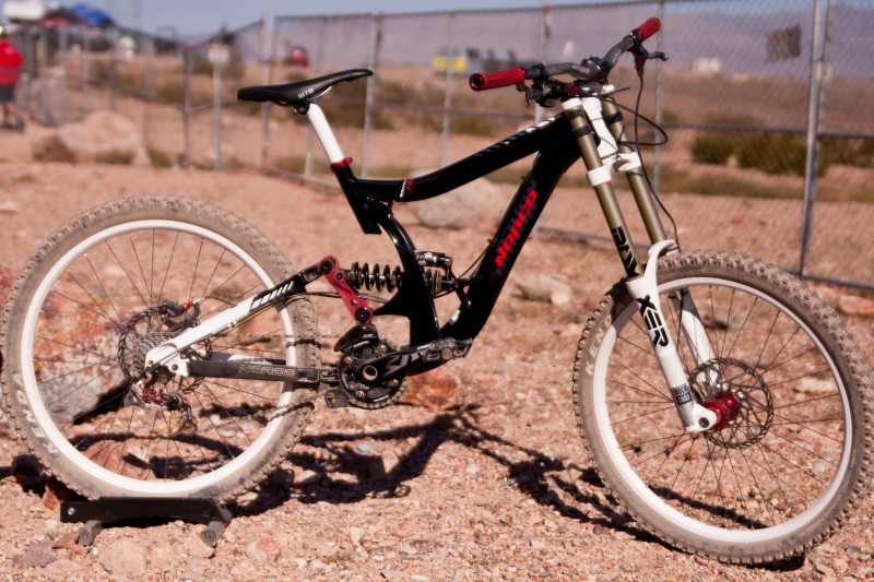
Norco Team DH
You must login to Pinkbike.
Don't have an account? Sign up

Join Pinkbike  Login
Norco Team DH
53 Comments
  • 12 1
 possibly one of the ugliest bikes ive seen
  • 3 0
 i agree
  • 11 0
 Norco seriously need to invest in some designers that aren't blind!!
  • 8 1
 this bike loooks gay
  • 10 0
 quite weird
  • 5 0
 yeah does look very weird , I wonder how they manage to make such bad choices with the cosmetics .Norcos always looked good to me up until about 2 years ago , and yeah i know its not all about looks but cmon Razz
  • 1 0
 Hmm but wait. When I pay much $$ for my bike I want it to perform really well on track and it should look nice. OK it isn't all about design, but why it can't be a little bit less ugly? IMO Santa V-10 looks so cool and it performs great for me, so why Norco can't match design with performance?
  • 1 5
flag nocco6622 (Sep 22, 2009 at 14:33) (Below Threshold)
 grey tires- ugly
  • 1 0
 red and black team DH from 06 I think it was looked wayyyy better than this thing
  • 1 0
 it is ugly, but those arent grey tires.... thats just the dust from where ever they were riding.
  • 10 1
 Sorry but... That photo makes me gag
  • 5 0
 I can't believe Norco has approved this design for their Flagship Downhill model. Every year since 2003-2009 has constantly been a huge improvement, one after the other, and now for 2010, its destroyed :/.. all those years of improvement... for nothing? or 50 steps forward to go 30 back? whyyy??
  • 1 0
 why is this one worse?
  • 1 0
 i think the frame looks like a mess, personally. if you look at last years or the years before, the frame was magnificent. all of the frame tubes flowed perfectly. 2010's frame becomes confusing.
  • 4 0
 I've gotta be honest, I've got 2 Norco bikes, love 'em to bits, but there's no way I'd consider replacing my A-Line with this... what's happened to the Norco frame design? Specialized have taken the "swoopy" lines a step further and the new SX and Demo look sick, not sure what Norco have done here apart from hit the thing with the ugly stick. Looks heavy and like something you'd get from Halfords! Gutting......
  • 7 1
 That is the worst looking bike I have ever seen
  • 3 0
 i agree that it is an unattractive color scheme. it does have a very nice parts spec anyways, which is more important than looks imo. it would probably have costed more to get components for the bike color matched.
  • 5 0
 If this frame doesn’t perform better than everything else out there it must be unsellable - damn it's ugly
  • 1 0
 looks like they tried to copy the look of my bike but were probly on shrooms or something:P i got the red white and black norco lookin like a spaceship!!Big Grin just wunna anodize red my link like that to finish the look... 08, before it all went wrong:P yepp norco kinda sucks lately with a replacement frame weighing 150grams=1/3 pound more than the good looking frame we payed forFrown got a 03 125cc with the same plates on the steer tube:O wtf!! all this b.s. is making that banshee legend or intense 951 look like my next frame...
  • 4 0
 norco knows how to make an ugly bike uglier
  • 2 0
 looks like something out of the early 90s even 80's if they could design a bike with 9inchs of travel then. nice idea with the travel but the ugliest bike i have seen to date
  • 4 1
 double-you tee eff were they thinking with this one.... taking their aesthetic inspiration from pre-2005 Rocky Mountain or something?
  • 3 2
 looks so shitty. if it werent for the forks, and componets i would have thought it were a CCM
  • 3 1
 and i thought last years models looked like shit...
  • 3 3
 me to this year my god children cover your eyes.
  • 2 1
 christ! cant you buy these from tescos?!?! haha looks so so cheap, like k-rider92 said, only the forks and components are any good on this!
  • 3 1
 Looks like you can get these from Argos for £69.95 (if you ignore the component spec!)
  • 1 0
 hahah give me a break norco get back to the drawing board give rocky mtn ther bike back !!!!!!!!! so copyed ther design norco suxxxxxxxxxxxx!!!!!!!!!!!!!!!!!!!
  • 1 0
 Looks like there going with a totally different rear shock setup this year.. i dunno the old was always good kinda looks like a specalized
  • 2 4
 It's just poor photo quality. I have seen that bike 100 times in person and it looks nothing like that. people are just hating for the sake of hating and not having informed opinions. I like the fact it looks nothing like all the other cookie cutter bikes
  • 5 1
 ok so you're saying this is photoshop?? how could it look different in real life??
  • 1 1
 I'm saying the photo is poor quality, blury and the image looks squished.
  • 2 0
 dude the bike doesn't change because of a blurry photo!!
  • 1 0
 your right!
  • 1 0
 i saw and test rode this bike at crakworx, and it looked different. it didnt have white rims or a white seatpost, and it felt sweet
  • 2 1
 That's ugly. Hey we bult the bike oh wait we forgot the bottom bracket ahhh lets stick it here. That will work. YIKES!!
  • 2 0
 it seems like norco is turning slowly into a specialized rocky mountain
  • 2 0
 the black, red and white dont mesh too well...
  • 1 0
 ya i agree with k-rider it looks terrible accept fork and i would of thought it was a ccm if it wasnt for the components
  • 1 0
 haha the front end of the bike looks like a gross chunky triangle, not smooth looking at all
  • 1 0
 nock off rocky mountain i would race the 2008 and crack the head tube and still like it over this shit
  • 1 0
 looks photo shopped... by a 2 year old.
  • 1 0
 fucking junk! just ride an intense!
  • 1 0
 Meh. I liked the '09's better.
  • 1 0
 get some proper desingers
  • 1 0
 edit
  • 1 0
 gross
  • 1 0
 k...why do all the team DH bikes look so ugly now...blek
  • 1 0
 Hmm thats aweful.
  • 1 1
 thats so ugly!
Dead Horse
  • 1 2
 i dont know what you guys are talking about, i think it looks really good.
Below threshold threads are hidden


Copyright © 2000 - 2024. Pinkbike.com. All rights reserved.
dv56 0.029068
Mobile Version of Website