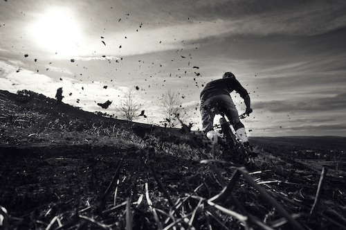
Roost, Sun, T Shirt... Spring is here. Matt grabbing the last opportunity to shred this trail before its hidden under a blanket of green as the bracken arises from hibernation.
samneedham.co.uk
Follow Me...
@SamNeedham_couk
28,444
Views
40
Comments
382
Favs
POD
Photo of the Day on
Mar 23, 2012
Selected by Ian Hylands - Some shots look great in B&W, and some don't. This is one of the former... Great use of B&W to show the roost without exposing us to the colors of a whole bunch of distracting dead vegetation...
( 41 PODs )
Photo info
- Album
- Our-Neck-Of-The-World
- Category
- All Mountain/Enduro
- Date Posted
- Mar 20, 2012 at 5:36Mar 20, 2012
- Location
-
Yorkshire, United Kingdom

- Trail
- Moors
- Riders
- Matt Wight
Photo details
- Photo Size:
- Camera
- Nikon D300S
- Lens
- 10.0-20.0 mm f/4.0-5.6
- Shutter Speed
- 1/3200
- Aperture
- 5.0
- Focal Length
- 14.0 mm
- ISO Speed
- 320
- Date
- 2012:03:19
- Time
- 11:44:45
40 Comments
- 48 3
real apocalyptic looking... too sick.
- 6 6
Maybe I am just getting crabby in my old age, but I still think B&W should be shot on film, not rendered in post processing on a computer. That said its still a sick shot.
- 1 3
I agree with sortafast. If these was done of film 35mm or medium format you could take this photo (with the light-meter set one stop down from your ISO to give it more contrast, always good to overexpose on film) and make it just as sick. Plus you would just scan it in anyway from he film to a digital file. But thats why doing this on film is good because youll have the best of both!
Film is not dead anyone that can shoot film is just going back to the roots. And thats fine with me
Film is not dead anyone that can shoot film is just going back to the roots. And thats fine with me
- 1 2
Whilst I agree that film does give a real natural warmth to a photo, it doesn't take a lot of effort in PS to make a digital image look really good in B&W. Hitting the B&W button just doesn't produce the best results I've found. If you play around with levels and curves you can get a really good picture. If you enhance the shadows (I dropped the shadow input to 0.20 when I tried it a minute ago), leave highlights the same and bias the mid-tones towards the shadows, then use a curve to take the brightness up in the sky only (without blowing out the sun) and it does improve the photo.
That said I love this photo, gives a really good view of what English riding is like!!
That said I love this photo, gives a really good view of what English riding is like!!
- 2 1
I think that film is the way to go if you have the intention of shooting black and white and the resources to develop your own film and print the negatives. However, shooting in digital is way easier and more time efficient and if you find out afterwards that a particular shot looks better in black and white, then by all means go for it.
- 1 4
i like it because the lack and white keeps you focused on the rider really well, but if you look closely the rider beens photoshopped to have a white glow. Not saying its wrong because without it the rider wouldn't attract enough attention. All im saying is basically dont over-photoshop, just turn the glow down abit.