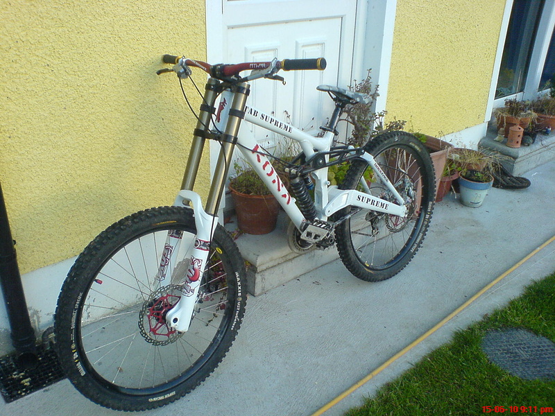

I know, it's all my mum's plants, still need to move them.. lol Cheers dude, kinda on the fence about it, if it sells, it sells, if not, I don't really mind....
1.Love the colour scheme - white/black/red. 2. The decals are a mess. Love the simple stencil downtube decal, but the fork needs simple red Fox decals to match (not the fussy ones you've used) 3. The seat needs to be black or red. 4. Love the bars. 5. Hate the D.O.P.E. decal/paint mess. Paint it black. 6. Hate the gold lock on grip clamps (gold is already so yesterday). Replace with black. If you take my advice you'll have a sexy bike. You asked for opinions!
yeah and the decals are on incorrect, fox logo goes on the side of the fork, as does the bands, the circle on the band should be on the outside
apart from the messy decals, nice bike
"rstwosix" 2. The decals aren't a mess, it's the way I designed them. 3. The seat is the perfect colour as I didn't want to go ott with every single thing the same colour which would make it look tacky and ott imo. 5. The Dope arm looks miles better like that than in black in looks dull and the pictures don't do it justice, it looks sweet as f*ck in real life. 6. I like the gold it looks sweet and gives the bike a better variety on the colour scheme, which as I've previously suggested would be ott if everything on the bike was black red and white.
Oh and "Haarlem" yeah I placed they fox decals like that so what? I'll see if I can still adjust them, if not ahh well, I like them this way anyway.
And black or red lock on clamps
p.s what does ott mean?
P.s. Ott = Over the top.
Cheers dude, kinda on the fence about it, if it sells, it sells,
if not, I don't really mind....
Do you still have than V10 man?
Cause that v10 is soo clean!
Wish I didn't have to sell it through...