PaintHouse Customs Contest - Winner!

Oct 31, 2009
by Tyler Maine  
Source: PaintHouse Customs

Congratulations to Lucas Bell of Victoria BC! You've won a one of a kind POC helmet painted by PaintHouse Customs! Lucas's design was super clean, well thought out, and just plain bad ass! Like the helmets design, it contained both strait and curved lines and had a 3D element while maintaining a 2D image.

Final design inside!
photo
2nd place - Evan Pavich

Second place goes to Evan Pavich for his pool cue design. Evan's design was very original and should be kept in his memory bank for future projects. Evan will be taking home some custom PaintHouse branded Straitline bar end caps!

The helmet, as expected, came out great! The design evolved from the original sketch into a very sophisticated piece of art. The plaid was pretty challenging to lay out after all, and to have it work from every angle. I decided to have two smaller Santa Cruz Bicycles logos rather than the big wrap around so as to not disturb the rest of the design. My original plan to paint the inner shell red was changed back to white as it went so well with the white pin striping. Lucas's name design was the icing on the cake and fit perfectly framed in the back of the helmet.

photo
photo
photo
photo
photo
photo
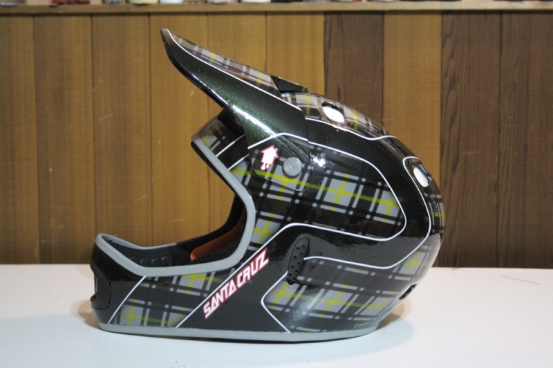
The Winner - Lucas Bell

I received many great designs and it could have been anyone's game, but like in any contest not everyone could win. Again, I'd like to thank everyone who entered for their effort in the contest. It was great to see the artistic element within the biking community. It was also nice to see so many entries from all over the world and of such varying ages. I encourage every one to keep up the good work. The world, and biking, needs creative minds!

photo

Special Thanks to Contest Sponsors:
Santa Cruz Bicycles
Pinkbike.com
POC
Straitline Components
PaintHouse.

For any question or enquiries on custom painted helmets check out painthousecustoms.com or email at: painthousecustoms@gmail.com

Posted In:
Press Releases


Author Info:
brule avatar

Member since Mar 27, 2001
3,581 articles

70 Comments
  • 16 2
 they picked the ugliest design and that helmets looks good till you see the ugly name
  • 7 0
 yeah it doesnt mach the rest of the helmet
  • 10 2
 A guy named BELL wins a helmet called POC, probably we will see a guy named POC wining a helmet called BELL.
  • 1 0
 Loooool Good one! x)
  • 5 0
 It looks like a sticker. and the pinkbike logo looks like one too. Was it even painted on??? For a PaintHouse product this helmet is way under par. Congratulations Lucas on winning.
  • 7 0
 Congratulations Lucas. Salute
  • 1 0
 HAHAHHAHA!! this thread makes me laugh... so many, so quick to judge, bicker and drop a neg..

Now, can't say I'm a fan either (in terms of being a first place winner).. But, as a airbrush artist/painter.. I'd have to give props to them. That's more time and skill than most of you would invest or wrap your head around.. (no pun intended) I'm more than certain it wouldn't matter who won, you can't please "everyone's" taste buds.

either way you put it... this helmet caught the eye of the powers that be, and they walked away the winner.. and you didn't..

congrats to the winner. now next time paint a helmet all these kids will love! LOL
  • 1 0
 I find this to be a more than excellent design, it's simplistic, yet technical, what I mean is, it looks so basic, but if you think of the designing that went into it it's ridiculous, it's not overly flashy, but still noticable. I find it's a perfect balance somehow.....

Congrats to this "Lucas"!
  • 11 6
 So many of you guys are complete ass holes. Congrats Lucas, looks good.
  • 8 3
 They're just expressing their opinions. Like someone said above, this is a website where people can comment on photos and express their individual tastes. So cheer down, bud.
  • 7 5
 ye but its nicer if u use discresion/ give a proper reason for your hating comments.. and u dont hav to write wat u think if its going to just do sumone down... so cheer up, bud
  • 4 0
 Congratulation to the winner. I personaly would not wear that helmet. It is ridiculous.
  • 4 0
 I like that, the way you worded that.

"It is ridiculous." Enough said.
  • 4 0
 its nice but it doesn`t really flow
  • 1 1
 i cant believe this got as much critisism as it has! the design on the helmet is what caught my eye for this thread in the first place. As for the comments that the second place should have won, look around im sure you can find a helmet with pool balls all over it, after all TLD just came out with a "bar" inspired helmet with dart boards and such on it. Clean, unique, and eye catching design. i give it an A+
  • 4 1
 Congrats Lucas, I like your style, but dislike painting of helmet. Its ugly. It look like some kind of shirt pattern.
  • 1 0
 Sorry, but i sticked couple of santa cruz stickers in right positions at originaly designed helmet and it looks much better, than that flight of fantasy..
  • 4 2
 really? THATs the winner? It does look sick and all but i'd expect more for a winner helm
  • 3 3
 lol i get strailine bar end caps, yes...wait..i have odi handlebars dammit damn u lucas bell u ruined it!! congrats to him anyways nice job damn everytime , 2nd place!!! i got to step it up lol
  • 4 3
 They are ODI compatible Facepalm
  • 2 1
 Wtf? First place is plaid, second is cue balls? Are you kidding me? Reminds me of high school art class. In fact, the cue balls are terrible as far as art is concerned.
  • 1 0
 might i add however, i do not like his tag on the back of the helmet, i think it clashes with the design pretty bad.
  • 3 5
 I prefered a looot more the one with balls... but the only good thing of the 1st place one its that the colour matches with the santa cruz logo.
anyways grats to the winers and specialy ph for the contest.

If u want take a loook to mine entries:
animalbiker.pinkbike.com/album/PaintHouse-Customs-entries
  • 2 0
 yeah you would prefer the one with balls
  • 5 4
 Like it or not, he just got a high quality helmet free of charge. Decent Big Grin
  • 2 0
 Well I hope you've got a massive head.
  • 2 0
 I liked the plain white helmets with the orange POC lettering.
  • 1 0
 same, i liked it better in stock colours
  • 1 0
 ohh no!! reminds me of burberry, keech!!
  • 1 0
 sexy helmet to the extreme
  • 3 2
 you put the pinkbike logo on un-even.. nice
  • 3 1
 looks even to me
  • 2 0
 Not sick.. Trendy.
  • 4 3
 thats one sad helmet come guys you know there was better
  • 2 2
 I think its sweet and everybody should stop complaining just cos they didn't win, congrats to lucas. Salute
  • 1 0
 congratulations for the winner!!!
  • 1 1
 Boyyyyyyyyy that's looks nice
  • 1 0
 nice
  • 1 1
 paints cool, but the helmet itself looks REALLY bad.
  • 4 4
 wow... second place was a way better pic then first
  • 6 6
 looks sick!!!
  • 6 6
 sick design, conservative yet flashy.. i like it
  • 4 40
flag Dodger-Jr (Oct 31, 2009 at 0:54) (Below Threshold)
 looks sick, but... I thought they got their design on the helmet? Either way still awesome
  • 8 1
 i still think there was better.
  • 10 1
 way better really
  • 15 3
 2nd place was so much cooler and would have loked better on the helmet, anyway im so jealous lol free helmet would have been nice
  • 6 13
flag epavichthesavage (Oct 31, 2009 at 14:31) (Below Threshold)
 indeed it would have been nice for me cause i has no helmet
  • 17 4
 if this is honestly the best this company can come up with, i doubt they'll be in business for very long...yellow and grey plaid stripes with green sparkles? it's like a leprechaun threw up on a lumberjack.
  • 4 1
 lol well put
  • 3 1
 reply @ michael-scott - My opinion, around my area you see more and more kids going for the more conservative looks towards their bikes/helmet. Rather than the more flashy, bright coloured ones which sit on the shelves for long periods of time. This may be different where your from, but this is just my areaaa Smile
  • 3 1
 I'm not saying things need to be flashy, i actually agree with you that a lot of the time a good clean look is the way to go. I just don't like this particular design or colours at all. I would expect more from a professional painting company. I'm sure the quality of the job is top notch, but aesthetically it's pretty bad in my opinion.
  • 1 0
 Yea thats true. i see where your coming from. Well put
  • 1 1
 really bad
  • 1 2
 i think its a very nice helmet but i dont like the chin vent shape.
  • 2 2
 defo no troy lee
  • 2 1
 reminds me of a greek helmet
  • 3 4
 verry nice helmet
  • 2 4
 thats a pretty sick helmet!!
  • 1 4
 I've never been a fan of the helmet design of the POC,congrats to the winner
  • 4 6
 So sick! Nice job guys.
  • 3 2
 ya i really like this design , much better then all the metro-sexual neon pink green and yellow crap thats knocking about atm
  • 1 3
 dope helmet
  • 1 3
 sick helmet
  • 3 0
 seeing as my comment got deleted...it still looks like a chavs cap.
  • 2 0
 Ugly helmet to begin with. They would have been better saying look we'll take a blank helmet in whatever size the winner should need, design a logo, an we'll match the design to the winning design. That way the helmet not only looked good but would fit all sizes of winner heads.
Below threshold threads are hidden


Copyright © 2000 - 2024. Pinkbike.com. All rights reserved.
dv56 0.055450
Mobile Version of Website