Powered by Outside

RockShox DIY Contest - A Look back

Aug 15, 2011 at 23:08
by Karl Burkat  
We've received over 500 designs for the RockShox DIY Contest! With 2 weeks left, it's gonna be pretty tight for the $12,000+ in cash and prizing. Not sure what this contest is about? Details here.

But now, for inspirations sake, let's take a look at the past artists tasked with creating the previous RockShox Totem fork sticker packs:

Press pics for the RockShox Totem over the years.
Michael Salter - Totem sticker pack no. 1

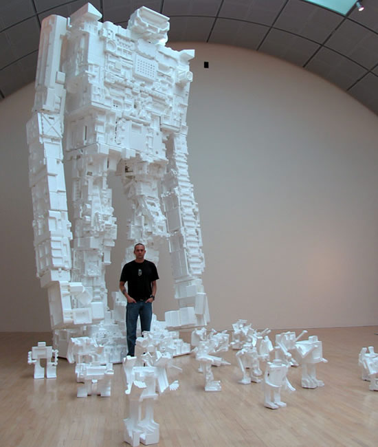
As a sculptor, toy designer, animator and graphic artist, Michael Salter describes himself only as an “obsessive observer” of our dense media culture. Michael’s attempts to deal with the veritable avalanche of content thrown at us from corporations and media outlets have resulted in an internationally recognized body of work shown in galleries from Brussels to New York, L.A. to London, Amsterdam to Chicago. His massive Styrobots, the largest being 22ft tall, loom over even the largest exhibit spaces. Michael is also an associate professor of digital art/new media at the University of Oregon where he encourages his students to “look closely at visual culture, dissect it, test it, soak it in, magnify it, dress it up and poke fun at it.” @semantography


Press pics for the RockShox Totem over the years.
Peter Fowler - Totem sticker pack no. 2

Welsh artist, Pete Fowler, and his ever-expanding “Kingdom of Monsterism” represent an incredible variety of work, from drawings and paintings to animations, sculpture and music. Pete has been influenced by everything from Japanese art, folklore and myths to psychedelia and “super nature” on his way to creating a world where “banjos are played by horned owls and synths tweaked by mutant horses.” While best known for his work for the band Super Furry Animals, spanning a decade of album covers from 1997-2007, Pete never seems to tire of art-making and experimenting. You can follow Pete and his constantly shifting obsessions @themonsterist.


Press pics for the RockShox Totem over the years.
Cody Hudson - Totem sticker pack no. 3

Graphic designer and installation artist, Cody Hudson, has translated his unique graphic style into any number of ventures. His artwork has been exhibited throughout the US, Europe and Japan including the MCA (Chicago), New Image Art (LA), Rock Gallery (Tokyo), and The Lazy Dog (Paris). His design firm, Struggle Inc. has seen anything but — working for clients like Nike SB, Burton, VW and Virgin — all resulting in Cody’s uniquely clean and iconic approach. Recently, Cody has even ventured into the world of rustic American cuisine with his new Michelin-starred restaurant, Longman and Eagle, in Chicago’s burgeoning Logan Square neighborhood, described by Cody as “The sort of place where a man can get a shot with breakfast.” @Struggle_Inc


Press pics for the RockShox Totem over the years.
Geoff McFetridge Totem sticker pack no. 4

LA-based, Canadian-born Geoff McFetridge tends to ignore the line between his commercial and personal work. He’s created award winning graphics since he was a student, garnering praise from the likes of I.D. Magazine and Art Directors Club, and continues to work with companies like Nike, Burton, Pepsi and Patagonia. His graphics are “Full of hands and teeth, objects and animals, hands and heads,” resulting in an aesthetic that’s both well-resolved and abstract. His work has been exhibited in Los Angeles, Berlin, Paris, London, the Netherlands and Japan. He’s started numerous companies, including Solitary Arts (a skateboard company), Pottok (where he prints wallpaper and fabrics) and Champion Studio, which recently created the entire graphic and typography package for Spike Jonze’s film, Where the Wild Things Are.


For full interviews with each designer, check out this snazy pdf outlining the contest.

Inspired to enter? Get your designs in before September 1st for a chance to win one of 10 RockShox Totem Forks!

Author Info:
karl-burkat avatar

Member since Jan 1, 2000
600 articles
Must Read This Week
Sign Up for the Pinkbike Newsletter - All the Biggest, Most Interesting Stories in your Inbox
PB Newsletter Signup

87 Comments
  • 208 19
 Do ANY of these guys even ride a mountain bike? This is not going to be a very unpopular opinion, but:

Its probably "just me", but I figure bike stuff - including graphics - should be designed by people that use it, or people that are at least involved in the sport or work for a manufacturer... What next - Paul Frank graphics? I don't mean to take anything away from the talented artists who have created the graphics (not crazy about any of the designs though), but KUDOS to RS for opening the opportunity up to the RIDERS...
  • 35 9
 Totally agree ^^
  • 20 183
flag Prehistoric (Aug 22, 2011 at 1:36) (Below Threshold)
 you are a hater. the both of you
  • 71 20
 Would you want a graphic designer to service your fork? Leave the graphic designing to the guys who went to school for it. Sure a rider could design the fork, but it's not going to be nearly as good as someone who does it for a living.
  • 83 3
 There are plenty of people who are both gifted at design and well versed in the art of shredding.
  • 12 5
 i believe thats why theyre running the competition, so they can find a mountain biker who is good at designing graphics. I imagine the winners design is gonna be touched up by someone professional, but its still a rider designing it. and im sorry chooched, but what you said is wrong. specialist jobs, like servicing a fork, does need someone whos trained in it, but picking up a pencil and drawing? i dont need a degree to design my own tattoos or owt, and im pretty sure practically everyone out there can draw. and saying its not gonna be as good as someone professional, you dont know that. when this comp is over im sure the totem graphics are gonna be the sickest ever.
  • 10 5
 That's a pretty dumb comment Chooched, are you trying to say there aren't any graphic designers with an interest in biking?
  • 17 0
 we all know you want my design with cheryl cole on it don't lie Razz
  • 10 2
 its art dude, it doesn't matter
  • 7 1
 @slandrews i know cheryl cole is pretty hawt, but you forgot abouut a whole LOAD of hotter chicks! Eek
  • 6 0
 its art. Nothing is good or bad, its just different, its all art. so everyone that enters the comp is just as good as each other. its just a matter of what the judges like more.
  • 7 0
 considering the prizes were sets of totems and stuff it does seem pretty stupid to give them to guys who dont ride bikes.
  • 2 0
 the current comp is for mountain bikers, but these are the old sticker sheets that came with totems. rockshox decided to go with a different approach to them this year, which i like.
  • 16 1
 Here's my 2 cents: It's a fork on my bike - I don't need to be reminded that it's about mountain biking. I don't need graphics of ladder bridges or shovels or jumps or silhouettes of guys doing tricks. The fork itself is already on my mountain bike, doing all those things. I think these sticker packs are beautiful and unique and area a great compliment to the product.
  • 17 0
 Really though, who needs 14 mustaches?!?
  • 24 0
 i salute all the internet warriors. keep the heated battles going, its great entertainment.
  • 2 1
 IKR.
  • 1 1
 i think that the artists should at least appreciate and understand MTB in the same way a photographer that may not ride does...
  • 8 0
 I think they should be doing less cartoon like and childish stickers, but these are only the stickers that come with the fork, they're not the stickers that come on the fork.
Here are my designs btw luket66.pinkbike.com/album/ROCK-SHOX-Comp
tell me what yous think and please fave if u like. Smile
  • 4 0
 ^^ Wow, those are pretty impressive man..! Lots of different styles in there...
  • 1 0
 "I don't mean to take anything away from the talented artists who have created the graphics"

That is exactly what you did though, not that I find anything wrong with your opinion on the matter or anything. Most of them were honestly not to eye catching for me. Except the third one, kinda liked that one.
  • 1 0
 Wicked stuff, LIke the idea the one guy had with including all the letters. I could see that getting interesting Smile
  • 14 0
 Personnaly, i'm a rider & a designer... I design since many years now and of course taste & colors aren't the same for every one, so i'm pretty agree with Jerryhazard, but Sram made this request to these artists for their references & reputation in the "graphism"... Ok, they maybe never ride a MTB in 45° down, but their stuffs were very cool, no? And the opportunity for a rider to made the 2013 totem's stickers pack is a f*cking good initiative...! I see very cool stuff in last weeks, some f*ckin scraps too... But you know taste & colors...
I propose this : www.pinkbike.com/photo/7001650
Faves if you like... Or offend me if you whant... Wink
  • 2 1
 Honestly, they all look cool but not for bikes. They are more suitable for wallets, watches etc, not for bikes let alone freeride bikes.
I really like your proposalSmile Did you enter the competition?
  • 2 0
 I really wouldn't like a watch to have little characters on them...
  • 1 1
 @ Mozarle : Yeah you are right... But some can be completly applicable on fork... & yeah i'm in the contest...

@ richardpowell : taste and colors... Wink
  • 2 0
 Would you like some beer style on your Totem?
  • 1 0
 I would like a totem please! lol
  • 3 0
 Hey Basstobass I love your design! Faved. Wink
  • 2 0
 I like it! Maybe I would prefer a little less noise on the stanchion, but who cares what I think! Iove the lack of color and use of wood.
  • 11 1
 dude seriously, this looks like stickers to decorate a 3 years old children´s toy. Not a extreme freeride fork
  • 1 0
 Maybe an alternative...?
www.pinkbike.com/photo/7001650
I doesn't know...
  • 1 0
 My thoughts exactly , would look cool and your kids Raleigh Jungle or maybe as a joke to put on a friends bike to make it look camp/stupid/childish
  • 1 0
 Don't change man, you are perfect...
  • 2 0
 Check out my entries so far - vineet.pinkbike.com/album/Rock-Shox-Totem-Concepts
I would also appreciate if you can let me know what kind of graphics your prefer on a Rock Shox Totem, and I will do my best to create them.
  • 10 1
 almost all of these designs are stupid I thinkSmile
  • 4 0
 As a designer and rider too, I must say that some of the past sticker packs miss at some point that link to our sport. Their iconography seems to be the artist/illustrator iconography and not the product or brand universe, but I guess is that's what you want/get when you ask an artist to do this kind of work.
They're all great illustrators and I can't even compete at their level but,... I've read all their interviews in the RS pdf, basically looking for some inspiration and references to this specific work... but I found no story related to the product or intended use.
I don't mean that the graphics should all be bike related, but some clear messages that relate with the final target would be great to see.
That was my main goal on my proposal as well as respecting the given brief.

Props to RockShox and Pinkbike to give us riders the opportunity to have a go.
  • 4 0
 Believe it or not your work is more applicable to a totem & on every fork in general & I mean it.
  • 1 0
 basically this kind of stickers can be applied anywhere, but if works well on the fork... better... thanks mozarle
  • 5 0
 all of these are so sick! and some of the other designs ive seen are crazy, going to be cool to see who wins. good luck to everyone who entered!
  • 7 0
 Forget the sticker pack - I want a 25 foot styrofoam robot!!!
  • 2 1
 glad somebody feels the same way I do.
  • 3 1
 REMEMBER ME! *shoots flames out of mouth*
  • 2 1
 hahaha
  • 1 1
 I guess I should have explained the joke: www.youtube.com/watch?v=omLpwpRH6PA
  • 3 0
 These graphics just don't excite me. Sure the Styrofoam robot looks fantastic, but the stickers.... eh. They're kind of boring, and would look more at home on some hipster's fixie than a totem. I liked what BasstoBass posted www.pinkbike.com/photo/7001650. It looks sharp and tough, while still looking modern.
  • 1 0
 Hit the nail on the head with the Hipsters comment - I wouldn't doubt if the most bicycle action these artist's see is their fixie with precision placed spoke cards...
  • 1 0
 I just put my XTR spoke cards on this morning!!!! Time to do some sweet skids..
  • 4 0
 yeah those are welldone but they dont attract me....i dont know ...maybe its just me or they seem to be just ugly at some point... but who cares i love totem..
  • 3 0
 It's their job as graphic designers, kinda stupid to say something like that. Should we now not let surgeons preform surgery on us if they havent themselves had the surgery done?
  • 4 0
 I don't need stickers on my Fork (RS) to remind me how cool it is or how well it preforms on the trail, as long as my seals don't blow i'm COOL.
  • 3 1
 I think what these artists made is great, but we all know that's it's impossible to do something that's will please everybody ! It's also more difficult to make a design that will fits a mountain bike fork than something like a table or something flat...
By the way, here is my last one, I hope you'll enjoy it ^^
www.pinkbike.com/photo/7025608
  • 2 0
 Unfortunately for a lot of people art and designs are becoming a big deal. People want something that performs well and looks good while they're using it. I think a lot of people will agree with me on this. Most of these designs are okay, but none that really strike me as excellent... however I myself haven't designed anything better.
  • 2 0
 Art and design are different things , and they are not new trends either. Art is expression since the caves age and design is solving needs, comunication, form, function etc. since Leonardo da vinci for instance ... This Sticker pack is more like a marketing action to this new product, and for that it involves someone art but some design logic also. Smile
  • 2 0
 I am a graphic artist and an avid mountain biker. No pun intended. I believe, I see the world and the RockShox Totem through a different lens. If you would like something fresh, easily identifiable, forever changing and lastly applicable to all possible bike color schemes, have a look at my conceptual ideas. There are 2 of 2. If you like my concepts, please vote for them and you may get them on your 2013 Totem(s). In turn, I may get a Totem. For sure, that would be outstanding to live my dream as an artist with all of you boys and girls rocking my designs. I do have many sketched concepts for the sticker pack waiting in the penumbra of my humble abode. Since this contest is just a peepshow for the Totem fork, vote for the merits of my displayed concepts for the rest will be a surprise even for RockShox. This has been my sales pitch! I hope you like what you see. I thank wholeheartedly those who have all ready expressed and interest and "fav-ed" my designs. Ride loose, lenmerderdenfer Please follow this link to view the aforementioned designs. lenmerderdenfer.pinkbike.com/album/Rock-Shox-Design-it-yourself-Sticker-Contest
  • 1 2
 sorry to say but your brain is a bit flicking like an hologram, holograms are cool but it's a finishing, not an idea.
  • 1 0
 Please reread my post. Thank you. After all, I designed the logos/graphics and compositions which are ideas, concepts or conceptualizations if you like. On another note, Cyan, Magenta,Yellow and Black are also types of visual tools or finishes as you boldly mentioned. Lastly, I need and chose a "finish" in order for you (Godi) and many others to see them by means of color.
  • 1 0
 I have submitted 4 variants for the RockShox DIY contest. There are now (4 of 4) images. Enjoy!

lenmerderdenfer.pinkbike.com/album/Rock-Shox-Design-it-yourself-Sticker-Contest
  • 1 0
 hey "chooched " i was going to enter this compition but decided not to because i have other shit to do with my life . anyway i ride everyday and i am going to school for graphic design and hhonestly these sticker packs suck . they have nothing to do with riding or forks r even the name of the forks . they do compleatly unrelated doodles that they probably drew getting high ands thought it weas good . it isnt !
  • 1 0
 I still think the best looking forks were the mid 2000 marzocchis. Simple, plain, boring to some, but not naked. Enough colour to catch your eye but not so detailed that it gets blurry and gross when scratched. And the stand out letters of "bomber" were neat, although they do get ripped off eventually.
  • 2 0
 Why's everything so fluffy looking? Looks more like some hipster bike stuff not trying to be negative I just don't see these as mountain bikeish.
  • 2 0
 i like codys the best. too bad the stickers arent available separately,without you having to buy a really expensive fork.
  • 3 3
 at the end of the day... you dont have to the stickers on the forks! but the sticker packs do look pretty sweet... and who cares if they down don't shred downhill or anything they're just the stickers that go onto the forks!
  • 1 0
 TBH, I wouldnt stick any of em sticker anywhere on my bike. If only we riders had the "skills"...Well, lets leave it to the geeks, while they are busy we are ridin' braap. xD
  • 1 0
 like the gangster animals except the whole pink deal. the rest are a little juvenile like hello kitty. maybe get troy lee to do your stickers.
  • 1 0
 the second set was my fav, the bottom right sheet was glow in the dark. Didn't put them on the bike but used them on other things.
  • 2 0
 heres a idea. just make the shock bodies transparent so the internals can be seen.
  • 1 0
 Really dope idea bro!
  • 1 0
 There's some nice entries so far but guaranteed they will pick some lame old crappy design like the previous packs
  • 1 0
 I would ride with the finger/nucks stickers on my argyle! Are these up for regular purchase?
  • 2 1
 and they all look like they can be seen riding some single speeder around downtown...
  • 3 1
 Props to all Graphic Designers.
  • 2 2
 All i have to say is, I'm not a huge fan of any of the designs! Rockshox can do better then this and i have seen better designs then these posted by riders here on pinkbike
  • 1 0
 cool stickers for the forks but i dont relly know what ones i like i need to see them on a fork
  • 1 1
 Or just team a rider up with a graphic designer that is how they usually get stuff done.
  • 1 1
 WTF, i was wondering why i got some crazy flower sticker when i asked rockshox for a pack. free-be nuff said
  • 1 0
 Hated every single one, Looks like they where designing for Ikea.
  • 1 0
 somebody make the bottoms look like a tallboy beer...
  • 1 1
 i hope the one with the cat trying to get out of the lowers are cool enough to win:$
  • 1 0
 those are tight af. y'all cray.
  • 1 1
 is there a way of seeing all the entries so far ? Smile
  • 2 1
 Giant robot is dope
  • 1 1
 Geoff McFetridge rocks as hell!
  • 1 1
 I don't really like any of the old sticker packs. Sorry.
  • 1 1
 I like the second last set
  • 1 0
 that would be sick


Copyright © 2000 - 2024. Pinkbike.com. All rights reserved.
dv56 0.033955
Mobile Version of Website