Basic Composition for Photography
Basic Composition for Photography, a tutorial...
Several months after I started creating this tutorial as a video I've decided it's way more important to just get it done. So I've ditched the video idea and just written it out.
Inside you'll find more information than you probably wanted to know about considerations in composing a photo...How we see...
Visual Perception has been studied for years and in the 1930‘s and 1940‘s Gestalt Psychologists raised questions about vision and perception that are still being studied today. According to the Gestalt Laws of Organization there are several main factors that determine how we group items based on our visual perception of them. These laws of organization have played a significant role in studies of how we see things, and how our eye moves through an image.
When we first look at an image we notice certain things before others, and our eye follows a predictable path through the image. This path is influenced by compositional elements, and the better our understanding of these elements the better our ability to influence how people view our images.
This type of study is way beyond the scope of this tutorial, however it is important to know that it exists.
Techniques for good composition
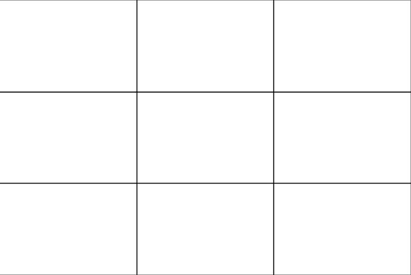
1. Rule of Thirds
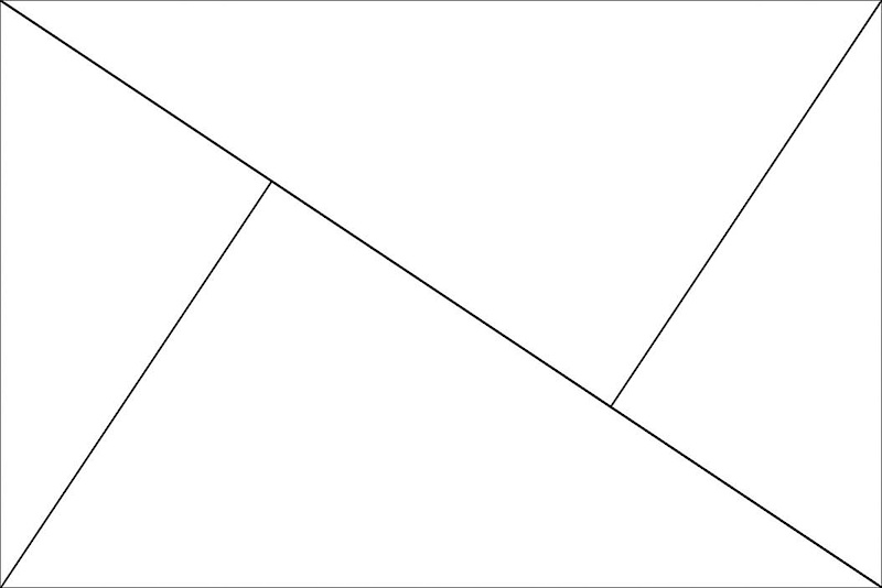
The Rule of Thirds draws two horizontal and two vertical lines equally spaced through an image. This creates three vertical and three horizontal stripes in our frame. Placing items in our image along these lines helps to create a pleasing composition.
The lines also create 4 points of intersection where the lines cross. It has been discovered that these intersection points correspond to areas that our eyes tend to move to first. By placing our subject or an object of interest on one of these intersection points we can create a better looking image and know that the viewers eye will be drawn to that point.
![photo]()
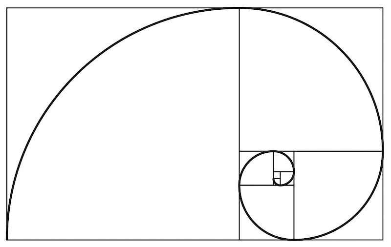
2. Golden Ratio
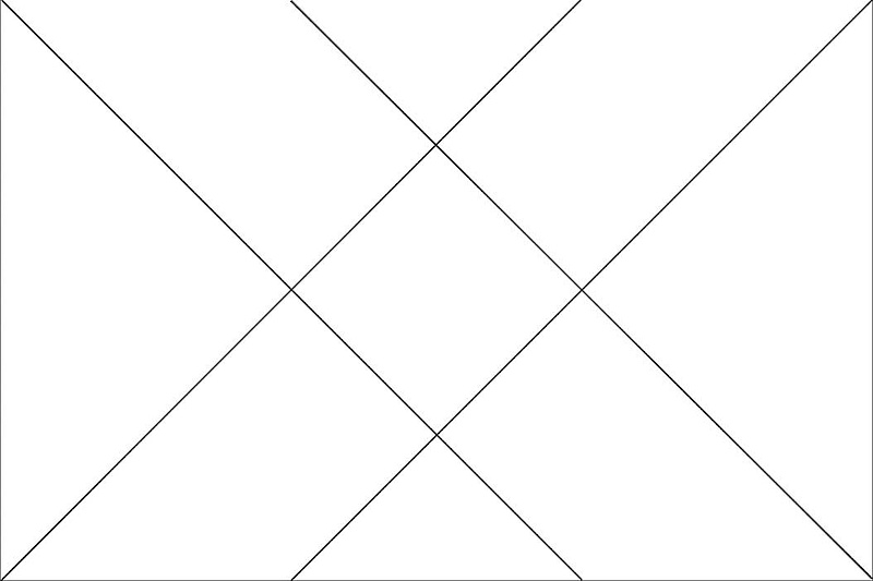
Golden Ratio is a rule based on the ration phi which is 1.618:1 The golden ratio was first studied by ancient greek mathematicians and has been since been studied by mathematical minds of every era. It has been used to define proportions and composition in art and architecture throughout the ages. The fibonacci sequence is a numerical view of phi. It is a sequence starting with zero and one and each remaining number is the sum of the previous two. Phi can be used to describe triangular/diagonal lines as well, and the Golden Spiral is a graph of shrinking proportion based on phi. In composition these can be used to define the different areas of an image as well as to place diagonal lines and curving lines in an image. In the image below the squares become smaller in the ration of 1.618/1 and the spiral they create is a golden spiral.
![photo]()
![photo]()
3. Rule of Odds
The rule of odds simply put states that an odd number of items is more pleasing to the eye than an even number of items. It is better to have 3 items in a photo than 2 or 4.
4. Depth of Field
Depth of Field is the amount of a photo that is in focus. Normally most of us try to keep as much in focus as possible, and it’s usually advisable to have the subject of our image in focus. However out of focus elements can help to draw our attention to the in focus subject of our image. If the out of focus (OOF) elements are a certain shape or color they can help to improve the composition of our image as well.
![photo]()
5. Triangles
Diagonal lines though an image create triangles, and triangles and diagonals help to suggest movement and create a dynamic and exciting photo. There are several different ways to position triangles in an image, and using the thirds lines or golden ratio to describe triangles works well.
![photo]()
![photo]()
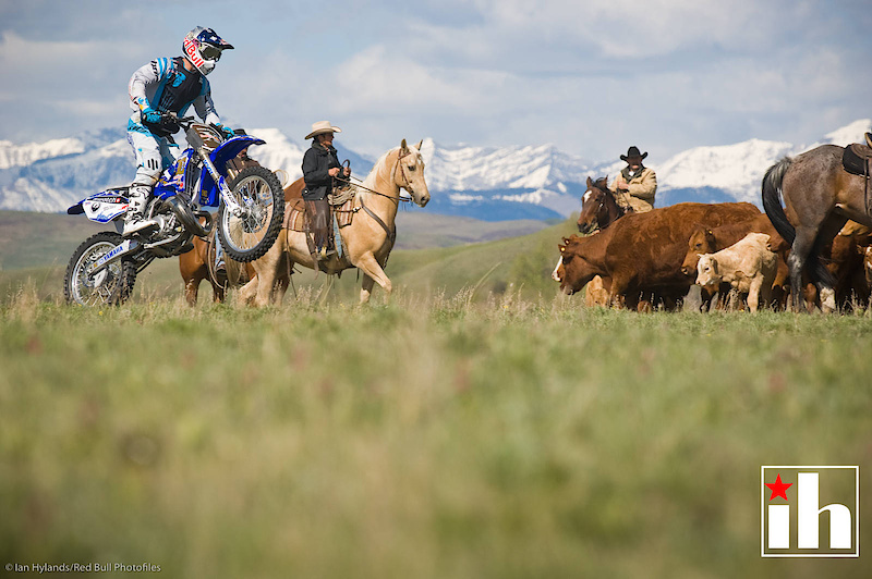
6. Direction/Space
Direction and Space in an image help to dictate how easy it is to look at. If the subject of our image is traveling from left to right then it should normally be on the left side of the image, moving into the space on the right. And vice versa. An object or a subject that is moving off of the page creates an uneasy feeling as we don’t know where it is going.
![photo]()
![photo]()
Principles and Elements
1.Proportion - The proportions of an images composition
If the subject of our image is disproportionately small or large it draws a lot more attention to itself. Our angle of view and our choice of lenses can change the proportion of items in our image drastically, so we need to be aware of the proportions of objects in our image and how they look.
2. Balance - An image should be balanced, it shouldn’t feel heavier on one side or the top.
Images should have some sort of sense of balance to them. If our subject is on one side of the image there should be something to balance it on the other. And keeping in mind the rule of odds if we have an object on one side of the image it probably will look better with two objects on the other side.
3. Harmony - There should be some sort of harmony between the various elements.
All of the elements in our image are interacting in one way or another, they share the same space and moment in time and we’ve chosen to include them. A strong image should have most of the elements in harmony with each other.
4. Orientation - Horizontal or Vertical, Up of Down?
The way that we orientate our image is important. Some images need to be vertical and some need to be horizontal as dictated by their use, but some scenes also lend themselves better to one orientation or the other depending on their lines and elements. If in doubt try both and see which looks better.
5. Path - The path that your eye takes when looking at an image.
When we look at an image our eye travels through the image in a certain way. It takes a while to recognize this and every image is different, however most peoples eyes follow a similar path in the same image. Knowing what influences how our eyes travel and being able to predict how they will travel in an image allows us to create stronger images.
6. Negative Space - The space between the other elements in our image.
Negative space is the space that is not part of the subject or other recognizable elements in an image, the best example is just white space or blue sky. Negative space can have shape and lines that influence our image just as much as the subject does, so we should be aware of it when we’re shooting.
7. Geometric Organization - Is there a certain geometry to the elements or shapes or their arrangement in the image?
Triangles are the strongest geometric shape in imagery, and they create diagonal lines between three objects. Whether we use them in our negative space or our composition of other elements triangles help to create strong images. Other shapes can occur in images as well, it’s good to be able to recognize them.
8. Repetition - Repeating lines and shapes can add to composition.
Repeated objects whether they’re lines or other objects can create patterns and add to the feel of our image. Repeated objects can form a line as well and lead the viewer into an image.
![photo]()
9. Light and Shadow - Light and shadow are compositional elements and all of the principles apply to them.
Light and shadow create lines and shapes and negative space and all of the other principles apply to the shapes that they create.
10. Perspective - Both the perspective of the viewer and the arrangement of perspective lines in our image.
As a viewer we have a perspective, whether it’s looking up or down at something. The perspective we choose for our image influences how it looks and how people react to it. Perspective also creates converging or diverging lines depending on our choice of lens and our orientation to our subject. Perspective Control or PC lenses (also commonly know as tilt-shift lenses) can change how lines in our image converge or diverge, and also control out depth of field.
11. Symmetry and Convergence - Symmetry can create balance and converging perspective lines or shapes.
Symmetrical photos can be very appealing even though they tend to break other rules of composition. When we have an image with a subject in the center that is balanced by symmetrical objects or lines on either side we are drawn into the middle. Such images often have an odd number of elements and quite often make use of converging lines.
That's really all I have to say about the basics of composition, and even this is probably treading on some more advanced stuff. If you think about the points above when you're taking photos your photos should end up looking better.
Good Luck!
Several months after I started creating this tutorial as a video I've decided it's way more important to just get it done. So I've ditched the video idea and just written it out.
Inside you'll find more information than you probably wanted to know about considerations in composing a photo...How we see...
Visual Perception has been studied for years and in the 1930‘s and 1940‘s Gestalt Psychologists raised questions about vision and perception that are still being studied today. According to the Gestalt Laws of Organization there are several main factors that determine how we group items based on our visual perception of them. These laws of organization have played a significant role in studies of how we see things, and how our eye moves through an image.
When we first look at an image we notice certain things before others, and our eye follows a predictable path through the image. This path is influenced by compositional elements, and the better our understanding of these elements the better our ability to influence how people view our images.
This type of study is way beyond the scope of this tutorial, however it is important to know that it exists.
Techniques for good composition
1. Rule of Thirds
The Rule of Thirds draws two horizontal and two vertical lines equally spaced through an image. This creates three vertical and three horizontal stripes in our frame. Placing items in our image along these lines helps to create a pleasing composition.
The lines also create 4 points of intersection where the lines cross. It has been discovered that these intersection points correspond to areas that our eyes tend to move to first. By placing our subject or an object of interest on one of these intersection points we can create a better looking image and know that the viewers eye will be drawn to that point.
Rule of Thirds
2. Golden Ratio
Golden Ratio is a rule based on the ration phi which is 1.618:1 The golden ratio was first studied by ancient greek mathematicians and has been since been studied by mathematical minds of every era. It has been used to define proportions and composition in art and architecture throughout the ages. The fibonacci sequence is a numerical view of phi. It is a sequence starting with zero and one and each remaining number is the sum of the previous two. Phi can be used to describe triangular/diagonal lines as well, and the Golden Spiral is a graph of shrinking proportion based on phi. In composition these can be used to define the different areas of an image as well as to place diagonal lines and curving lines in an image. In the image below the squares become smaller in the ration of 1.618/1 and the spiral they create is a golden spiral.
Golden Spiral Lines
Golden Sector lines are similar to thirds lines but are a little bit closer together.
3. Rule of Odds
The rule of odds simply put states that an odd number of items is more pleasing to the eye than an even number of items. It is better to have 3 items in a photo than 2 or 4.
4. Depth of Field
Depth of Field is the amount of a photo that is in focus. Normally most of us try to keep as much in focus as possible, and it’s usually advisable to have the subject of our image in focus. However out of focus elements can help to draw our attention to the in focus subject of our image. If the out of focus (OOF) elements are a certain shape or color they can help to improve the composition of our image as well.
The out of focus foreground and background create separation with the subject and draw us to it
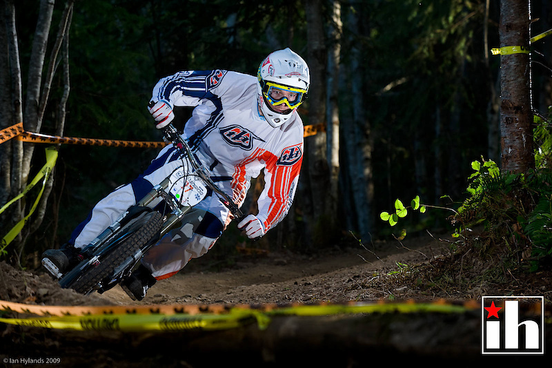
5. Triangles
Diagonal lines though an image create triangles, and triangles and diagonals help to suggest movement and create a dynamic and exciting photo. There are several different ways to position triangles in an image, and using the thirds lines or golden ratio to describe triangles works well.
Triangle Lines
Triangle Lines
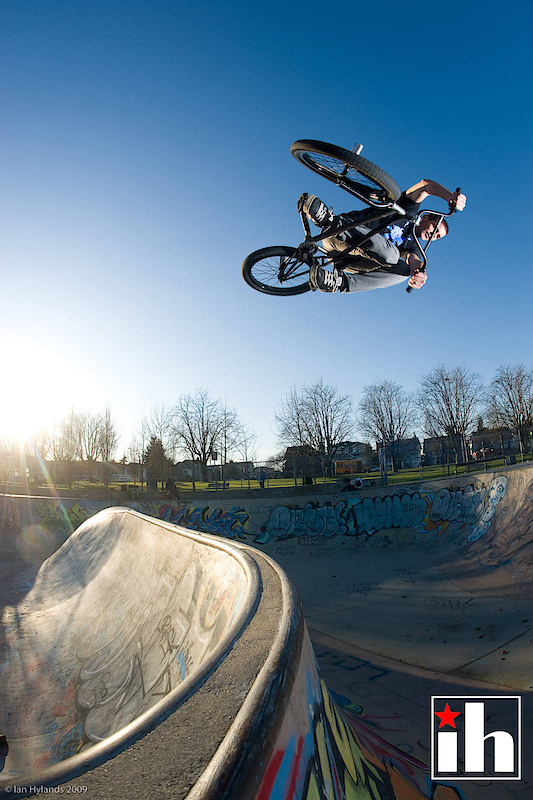
6. Direction/Space
Direction and Space in an image help to dictate how easy it is to look at. If the subject of our image is traveling from left to right then it should normally be on the left side of the image, moving into the space on the right. And vice versa. An object or a subject that is moving off of the page creates an uneasy feeling as we don’t know where it is going.
Curtis Keene rides into the frame on a triangle line
Kym Grosser, darkside out of the photo...
Principles and Elements
1.Proportion - The proportions of an images composition
If the subject of our image is disproportionately small or large it draws a lot more attention to itself. Our angle of view and our choice of lenses can change the proportion of items in our image drastically, so we need to be aware of the proportions of objects in our image and how they look.
2. Balance - An image should be balanced, it shouldn’t feel heavier on one side or the top.
Images should have some sort of sense of balance to them. If our subject is on one side of the image there should be something to balance it on the other. And keeping in mind the rule of odds if we have an object on one side of the image it probably will look better with two objects on the other side.
3. Harmony - There should be some sort of harmony between the various elements.
All of the elements in our image are interacting in one way or another, they share the same space and moment in time and we’ve chosen to include them. A strong image should have most of the elements in harmony with each other.
4. Orientation - Horizontal or Vertical, Up of Down?
The way that we orientate our image is important. Some images need to be vertical and some need to be horizontal as dictated by their use, but some scenes also lend themselves better to one orientation or the other depending on their lines and elements. If in doubt try both and see which looks better.
5. Path - The path that your eye takes when looking at an image.
When we look at an image our eye travels through the image in a certain way. It takes a while to recognize this and every image is different, however most peoples eyes follow a similar path in the same image. Knowing what influences how our eyes travel and being able to predict how they will travel in an image allows us to create stronger images.
6. Negative Space - The space between the other elements in our image.
Negative space is the space that is not part of the subject or other recognizable elements in an image, the best example is just white space or blue sky. Negative space can have shape and lines that influence our image just as much as the subject does, so we should be aware of it when we’re shooting.
7. Geometric Organization - Is there a certain geometry to the elements or shapes or their arrangement in the image?
Triangles are the strongest geometric shape in imagery, and they create diagonal lines between three objects. Whether we use them in our negative space or our composition of other elements triangles help to create strong images. Other shapes can occur in images as well, it’s good to be able to recognize them.
8. Repetition - Repeating lines and shapes can add to composition.
Repeated objects whether they’re lines or other objects can create patterns and add to the feel of our image. Repeated objects can form a line as well and lead the viewer into an image.
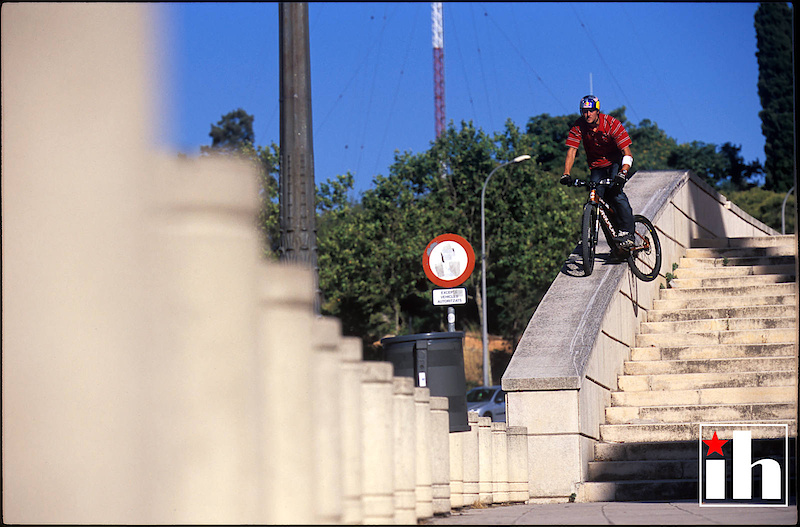
In this image the line of posts on the left side draw the viewer to the right and into the image. The depth of field also draws us in and our eye initially wants to come to rest at the junction of the posts and the ledge.
9. Light and Shadow - Light and shadow are compositional elements and all of the principles apply to them.
Light and shadow create lines and shapes and negative space and all of the other principles apply to the shapes that they create.
10. Perspective - Both the perspective of the viewer and the arrangement of perspective lines in our image.
As a viewer we have a perspective, whether it’s looking up or down at something. The perspective we choose for our image influences how it looks and how people react to it. Perspective also creates converging or diverging lines depending on our choice of lens and our orientation to our subject. Perspective Control or PC lenses (also commonly know as tilt-shift lenses) can change how lines in our image converge or diverge, and also control out depth of field.
11. Symmetry and Convergence - Symmetry can create balance and converging perspective lines or shapes.
Symmetrical photos can be very appealing even though they tend to break other rules of composition. When we have an image with a subject in the center that is balanced by symmetrical objects or lines on either side we are drawn into the middle. Such images often have an odd number of elements and quite often make use of converging lines.
That's really all I have to say about the basics of composition, and even this is probably treading on some more advanced stuff. If you think about the points above when you're taking photos your photos should end up looking better.
Good Luck!
Author Info:

Must Read This Week
Edit: *facepalm* just saw it was his article
If you know about the rule of thirds and odds and evens and all that other stuff and you put something dead center in your shot understanding the effect it has on the image and the way it's viewed, and that's what you want, then that's ok.
I find that many of my missed shots are late shots where everything is perfect except the rider is going off screen. If it was moved ahead to give a sense of direction and where they're going, it would be perfect, but because I was late or bad setup or whatever, it just doesn't FEEL right. I think these rules are natural; the rules were written after people decided what they liked to look at, so breaking them does give that sense of uneasiness, as you said.
My favourite teacher from hand drawing, an old guy professor at fine arts always said:
1.I don't care what you tried to express with your drawing, I judge only what I see you drawn
2.If You want to break the rules, learn them first, for how can you break something you don't know how to follow
Great article! During my studies I only touched composition in photography or drawing. Good to see some wrap up finaly!
I saw an excellent documentary about how did art got degenerated after WWII by huge art galleries in London and NY. (I mean the art, proper art, huge art, big guys,: Salvadore Dali, Mies Van Der Rohe - not this "modern" beige we see today with some who-the-F-is-this bold shaved guy with a scarf and wire round glasses) How these guys driven by lust for money turned art into lucrative business, finding sponsors in national companies, and huge corporations (sharing the income ofc). Then pushing enormous amounts of money into promoting some excentric "artists", making paintings from sandwiches, setting prices of paintings of a bloody circle for hundreds of thousands $. Just so that people start to believe this is art, and then you find a rich snob to buy it. A cost of circle or rectangle can get to 100 000 bucks: it costs 10$ to produce it (wierd artist needs food, alcohol, drugs and an atelier at some falling apart attic) and a 1000$ to promote it. Did I mention there is no tax on these things in most countries? Then you get guys like Damien Hirst who do sort of "art industry": many ateliers around the world, thousands of employees. These guys sell their stuff like "Great White cut in half" for millions.
After digital camera revolution, when SLRs got cheap, we have so many "photographers". Among bikers I know so many who believe it's so trendy to race and shoot pics afterwards! I'm special! oh... so u done your race tun, and you have time to set 5 flashes carry 10 lenses two SLRs... you came 159th?!
That's why we need rules, people that know rules and spread them forward. So our children don't end up in this beige.
Art in galleries is about intellectual expression through what ever media you choose. Music is art do we all like the same music?
Not sure about your point about shooting into the sun, I do it all the time, way better that shooting front lit in bad light. I'll be doing 2 different tutorials on light in the next few months, one on basic natural light etc, and one on advanced lighting. I do like your comment about shooting from different angles, it's a really key point that I missed in this. Shooting from a standing position is the way we normally see things every day, so it's not very interesting most of the time...
As for the 15% of pinkbikers that will read the entire article, that is my target audience, I've taught photography long enough that I'm over teaching to people that aren't interested. If 15% actually read this and learned something I'd be stoked!
I think things like where and when taking a picture, angles etc, are the subject of creativity, and if you know some rules and have talent, sure we have good photos, how many riders have the best bike and the best equipment and simply do not know use it, and how many riders with a simple equipment do what they want? the same goes for everything, just pure talent and passion.
Ian thanks for the tutorial, few take the time to do something like this,