2013 Photo of the Year - Finals
And then there were two. Sterling Lorence and Reuben Krabbe have made it through their respective sides and meet in the finals. Reuben just squeaked in edging out Dave Trumpore by 35 votes in one of the closest match-ups we've seen. Go vote the final time this year!
Vote Now for the Finals:
Go to Voting Page
Go to Voting Page
What's at stake? $10,000 Cash and a 2014 Specialized Demo with full SRAM components
Thanks to Specialized Bikes and SRAM.
Vote Here
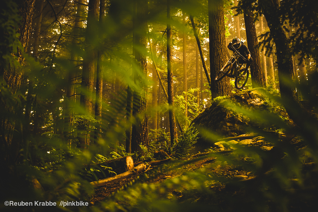
Reuben Krabbe
 |
Go to Voting Page
Sterling Lorence
 |
Go to Voting Page
 |
What's at stake? $10,000 Cash and a 2014 Specialized Demo with full SRAM components
Thanks to Specialized Bikes and SRAM.
Author Info:

Must Read This Week
Sign Up for the Pinkbike Newsletter - All the Biggest, Most Interesting Stories in your Inbox
PB Newsletter Signup
if someone could help me out
Typical classy pinkbike.
But:
Reuben's shot is capturing a moment of tearing down a trail immersed in west coast rain forest.
So torn......
Two great shots made it to the top again. Typical classy pinkbike!
Reuben's has a silly tint and the composition isn't that great. There were some good photos in the mix but these are not the best two (just like last years comp!)
To explain how it is so aesthetically pleasing in a much simpler manner, the shot follows the rule of thirds. Imagine the picture divided up into 3 columns and 3 rows (a total of 9 rectangles). The dust takes up roughly the first two columns. The ground takes up roughly one of the 3 rows. Vanderham and his bike are on the line between the 2nd and 3rd column. All of this makes it a great shot.
Just askin like!!
I would also like to point out that Sterling's photo looks like it could be recreated in a driveway near you (minus Vanderham) haha
Lets see a 35 mm B&W photo of the year contest, dark room and all
I mean come on...
And this is nothing about the photographers either, because both of these guys are great, and all of the guys represented this year prove that they deserve it every year.
That it not the point here, but I'm sure that the idea that to 90% of mountain bikers, one of these photos would mean NOTHING if seen in a calendar means nothing to anyone else.
I'm not voting for sterling because I can't actually tell what's going on in the photo, wheres the rider going?
Two great photos. Great job to the finalists. They should both win.
There is an incredible amount of skill that both photographers exhibit and if people would take a few minutes to think about both photos they'd see that instead of trying to downplay and crap on what both guys have achieved. One isn't a generic shot, one isn't more "sloppy" or whatever, they're both great.
It's best not to take these things too seriously. Reuben & Sterl both have rad shots up there so no need to hate on anything just because the outcome isn't what you personally would have preferred.