First Look: Rockshox 2013 Graphics
Rockshox is showing off its 2013 range of forks here at the Taipei Cycle Show. Every fork in the range will be getting a new look. Rockshox has gone for a pretty radical graphic re-design, bringing in big, geometric shapes, a simple logo and generally, a more subdued feel. Tones of grey seem to be in fashion too. There is rumour of changes to what's going inside some of them too, but they were tight-lipped about that for now...
![Rockshox 2013 paintjobs]()
![Rockshox 2013 paintjobs]()
![Rockshox 2013 paintjobs]()
![Rockshox 2013 paintjobs]()
![Rockshox 2013 paintjobs]()
www.rockshox.com

Boxxer
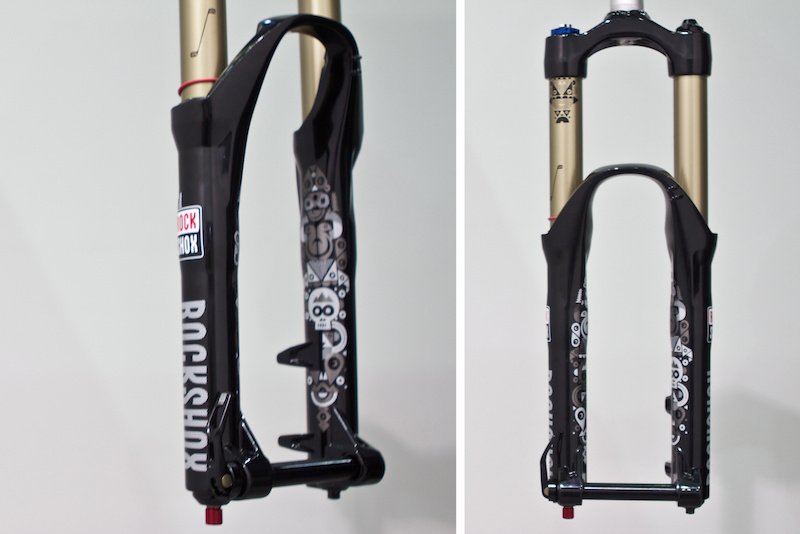
Totem (stay tuned for a first look at the sticker pack courtesy of Mike Serafin, winner of the Totem design contest on Pinkbike)
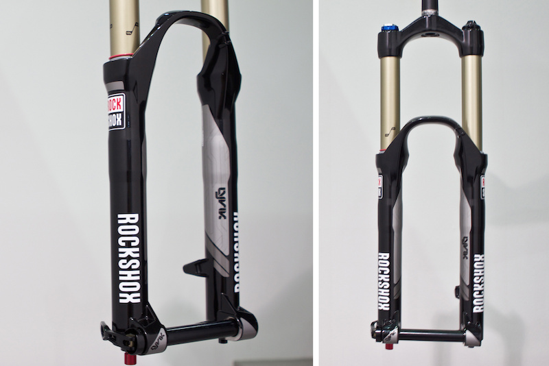
Lyrik
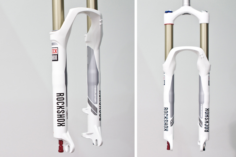
Revelation
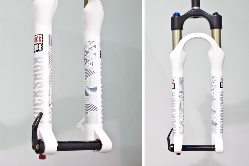
Argyle
www.rockshox.com
Author Info:

Must Read This Week
Sign Up for the Pinkbike Newsletter - All the Biggest, Most Interesting Stories in your Inbox
PB Newsletter Signup
www.pinkbike.com/photo/7803914/#top
Yep. Pro and sleek. I'm still not sure but those are different and kinda refreshing. But now, we need an all black fork.
Stanchion graphics on the totem kicks ass too.
Hmm I see where you are getting at. Personally I'm a very big fan in a very minimalist and generic look as these 2013 forks look now.
I'm not into too flashy aggressive styling because I feel like they are just very neat and interesting at the beginning but a year into owning them I lose fondness for them quite quick and get sick.
Minimalist and generic looks will never go out of style. Always be slick and sick.
The best analogy I can think of at the moment is how the Merc SLK evolved.
My favourite generations would be the R170 and R172
R170 generation was smooth and roundish. To this day I find it interesting to see on the road.
R171 generation had an incredibly aggressive front end with a sharp edged nose angled down and a menacing grill.
R172 generation is quite laid back and shows some resemblance to the R170 and has the defining look of the R171, but without the aggressive corners and grill.
With the R170 and R172 having a less out going look will forever be something interesting to most eyes because it appeals a bit to both sides. Sure it's a little boring to some, but no one will ever hate the look because of the less aggressive one sided styling of the R171. With the R171 you make a definite hate and love group, but the middle group stays murky.
Any ways thanks for showing me your insight and I hope you enjoy mine!
@surgesunday
Tripping balls bro.
Seeing SHOX written like "ROCKSHOX" really throws me off